Sign Visibility Tips

Added on 27 December 2013
By TopMade
0 Comments
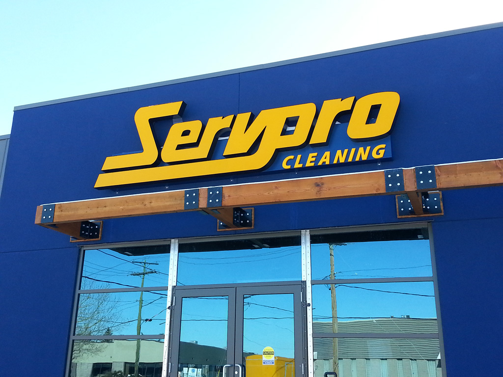
When it comes to signs, colour and lighting choices have great impact on visibility. How can you achieve maximum visibility both day and night?
- Lighting – Depending on where your sign is located, we can recommend lighting and colour choices that are lit externally or from within.
- Timers – We are surprised at how often we see stores forget to ensure timers are controlling their lighting. People assume lit signs are a signal for “we’re open” – so if the sign is off or on by mistake, you’ve created an inconvenient assumption for people who park or walk up. If you want your signs on even when you’re not open, be sure to display your hours prominently so people don’t have to get out of their cars and knock on your doorstep.
- Reflective Lettering – In addition to lit signs, reflective lettering can give you decent visibility in low light. Ask us about your best colour choices to suit your artwork.
- Letter Size – To figure out the letter size based on viewing distance, you can work backwards. Letter height in inches= 10 times the ideal viewing distance in feet. This means a 5″ letter height is ideally viewed at 50 feet. About 3 times this viewing distance give you the maximum distance it would still be readable, but we don’t recommend you assume it will be readable to everyone.
- Colours – According to the Outdoor Advertising Association of America, the following colours are the most easily readable combinations:
BLACK on YELLOW
BLACK on WHITE
YELLOW on BLACK
WHITE on BLUE
GREEN on WHITE
BLUE on YELLOW
WHITE on GREEN
WHITE on BROWN
BROWN on YELLOW
BROWN on WHITE
YELLOW on BROWN
RED on WHITE
YELLOW on RED
RED on YELLOW
WHITE on RED
Please give us a call to assist you in figuring out the best colour combinations for your artwork.
