Typography and Your Signage

Added on 17 January 2017
By TopMade
0 Comments
Driving around town we see all kinds of signs, good and bad. Sometimes you’ll see some really questionable typographical choices clouding the whole point of a sign: to convey information. A little knowledge of basic typography can go a long way toward improving your signage.
Legibility is the first consideration in designing a sign or graphic, particularly if your goal is to direct customers or employees around your place of business. When time is of the essence– like finding an emergency exit, or maybe the washroom—elaborate, difficult-to-read fonts will be a negative experience for your visitors and can reflect poorly on your organization. Fancy type can be hard on the eyes, especially from a distance. Typographical choices should complement the purpose of the sign (informing, directing or attracting) and allow for being readable at a reasonable distance.

When not properly used, font, size and colour can confuse the message. Random changes in style can be confusing as well. It is important to find a consistent typeface to use throughout your business; this should be part of your brand identity. Select a font that effectively communicates your message, image and design needs. A nice clean type style choice will get your message across, not just more rapidly, but more memorably.
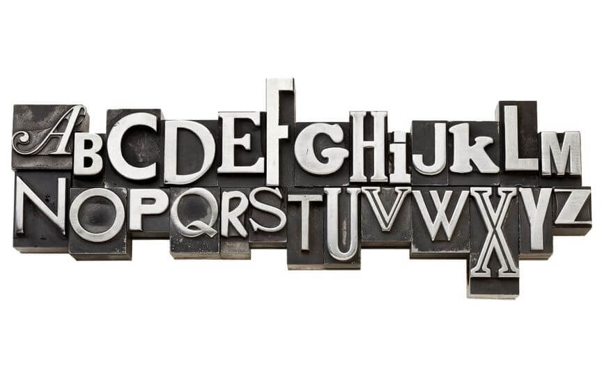
There are three main categories of typeface: Serif, Sans Serif, and Script. Serifs are short finishing strokes at the end of each stroke in a letterform. They are sometimes called “feet.” A large body of text is easier to read if it is in a serif font because these little ornamental effects help guide the eye from one letter to the next. This is why the publishers of books, magazines and newspapers use them almost exclusively. As for Sans Serif, obviously, sans means “without.” Sans Serif fonts are commonly used for headlines or titles. Their clean, simple appearance helps them stand out.
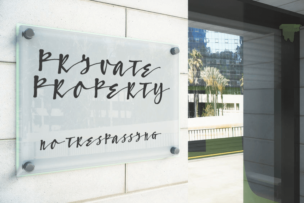
Script refers to typeface that mimics hand-lettered writing by pen, brush or pencil. It can add a touch of elegance in small doses, but can quickly destroy a design if overused. Script fonts are not intended for body copy or heavy usage; using them that way will detract from your message. Think of it as decoration; it’s meant to attract the eye, but too much decoration and you won’t know where to look! In other words, you may have a large box of jewelry, but you wouldn’t wear it all at once… would you?
When wanting to emphasize your message, sometimes the first impulse is to put it in all-capital letters. This is the print equivalent of shouting. While it might be effective for something short and urgent (think ATTENTION or DANGER), for longer messages it can actually make the message harder to take in. This is because of the way our brains process visual information; we don’t just read a stream of letters, we read words at a time– phrases, too– and these have “coastlines”. Putting a word in all-caps takes away its distinctive shape, making it just a rectangular letter stream. The longer your message is, the more important it is to utilize lowercase letters.
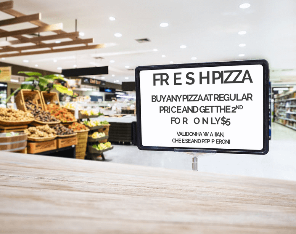
Kerning refers to the space between letters. This usually requires some tweaking in titles, headlines and signage. Letters that have verticals next to each other (e.g. N, H) require more space between them to appear balanced, while neighbouring curves (e.g. O, C) require less space. The least space is needed between letters with lots of white space on their side edges (e.g. A, T, V). Getting the right kerning to achieve visual balance is really an art form, but even more important than visual balance is just being understood! If you’re not careful, “L I” can be seen as “U”, “c l” can be seen as “d” and so on, leading to endless embarrassing possibilities.

Tips:
- If you’re using more than one font, make sure the types contrast. For instance, you could use a sans serif caption over a body of text in a serif font, but you’ll want to avoid mixing two slightly different serif fonts.
- Use script fonts sparingly, and never ever use all-caps in a script font.
- Stick to a unified font style as part of your brand.
- Don’t use more than two to three fonts in a sign design.
- Be clear, be concise and resist the urge to use a fancy but hard to read font. When in doubt, keep it simple and remember that less is more.
- Try to be mindful of how your sign might appear at a glance. Squinting helps.
Sometimes typography seems to be an afterthought, but at Topmade we use it to help make your message clear and memorable. Give us a call to find out how we can improve on yours.
