How’s your sign holding up? Driving around town we see lots of neglected signage, and since that’s the thing we do, we can’t help but wince sometimes.
Dirty Awnings
All outdoor signage is going to accumulate dust, road film, bird droppings, etc., and a dirty awning sends the loud and clear message that you don’t care about your image. Sometimes all it takes is a firm spray of water to freshen up your awning– particularly if you do it regularly– but if you’ve been lax you’ll need to get up there with a ladder, brush, and warm, mild soapy water to clear away the grime. It’s time well spent to make your business stand out; try cleaning your awning at least as often as you clean your windows. Don’t expect a rainstorm to take care of it for you; that’s likely just going to add streaks to the mess.
Vinyl Letters Peeling Off
Nothing makes your business looked abandoned quite so effectively as cracking, peeling vinyl letters or logos. There are two types of vinyl film used, namely Calendered (short term) and Cast (premium). They’re basically the same stuff, just different processes, cost, and handling properties. Bottom line is this: the less you spent on your vinyl, the sooner it will have to be serviced or replaced. Given enough time in the sun, cracking or peeling is unavoidable; all vinyl has a maximum outdoor life. Left uncorrected, it too sends a bad message about your image. Peeling vinyl screams it’s time for you to get your signage refreshed.
Burned Out Lighting
What do your channel letters spell now? Are your customers stopping for gas at the _hell station, or perhaps your Funeral Home has become a Fun_ Home? It’s not a problem restricted to channel letters either; back or front lighting can also fail, to humorous (or maybe tragic) effect. Don’t let lighting failures make your business look bad!
General Fading
No matter what material your signage is made from, weather and sunlight takes its toll, and some materials and colour processes deteriorate faster than others. A good sign manufacturer is going to make sure you’re using the most durable materials from the outset. For instance, if sign elements are made of wood, that wood needs to be properly preserved; if paint is used, it needs to be of the correct type to bond with the underlying material. There are so many other considerations, not the least of which are the weather conditions to which the sign is subjected.
Winter Time Changes
If your lit signage is on a timed switch, you’ll need to make adjustments for the seasonal variation of daylight periods, not to mention the the back-and-forth between Daylight Saving Time and Standard Time. If you’re open until 8 PM in December, but that timer still reflects a 9:45 sunset, it could cost you traffic when people see an unlit sign and assume you’re closed.
Sight Line Changes
Is your sign still as clearly visible as when it was installed? If trees, new construction or neighbouring signage is obscuring your message, it might be time for a refresh (or possibly some tree pruning).
A Footnote About Flags…
We don’t prune trees, nor do we sell flags… BUT if your institution or business displays a flag, show you really care and fly it respectfully and proudly! At minimum, that means taking care not to fly a flag that is badly faded, tattered or torn. We recently passed by one Canadian flag that had been flying so long it had faded to pink and white, and was so frayed that the second red bar was completely gone. It’s better not to raise a flag at all than to fly one in such condition.
If your signage is ailing in any way, Topmade can help. We want your business or institution signage to send the best possible message: that you care how the world sees you!

Added on 23 October 2017
By TopMade
0 Comments
Sometimes clients miss critical pieces of information when ordering signs; so we thought we’d provide a simple signage checklist. Might as well tick these off, to avoid being ticked off later if your sign misses the mark, and you’re smacking yourself in the forehead (hopefully not on your brand new sign!). Here goes…and yes we’ll plan to add to this list as we go!
- Spell Check your Sign. Make 100% sure that all of the sign is checked for correct, or even preferred spelling. This can also be a missing word, like a “to” or a “the”. Such attention to detail can make the difference between looking amateur or professional.
- Be Precise about Colours. Not everyone knows what shade their logos exactly are. To avoid confusion, check and select your colour via Pantones or CMYK numbers online; this can be done through referring to a printed booklet or online colour charts.
- Consider Visibility in Choosing the Size. It’s very important to know from how far away your sign will be viewed. Too many words, or too-small an image, and the sign loses effectiveness for passing traffic. Click here to refer to our guide on “How Large Should your Sign Be?”
- Does it Have the Right Data on it? Many signs are missing critical data – like a website address, phone number or business hours. It might be as simple as adding a “24h” or “8-5 daily” to the main sign, or a website address. Remember, a sign is your sales representative when you cannot be.
- Bring us Photos and Measurements of the Location. Don’t just say, “I want a sign about this big.” You could easily over or underestimate the location and environment in which it will be displayed. Take photos close to, and further away from the location, and put a ruler or measuring tape in the photos. That will help us immensely in creating the ideal size. For larger jobs, we will, of course, visit your location to measure it ourselves prior to getting final specifications.
- Check the Mounting Options. You might be surprised to learn that you’ve planned to mount your sign on a concrete wall that won’t take typical hangers, or that it can’t be breached with mounting equipment that will keep your sign stable. Be sure to carefully check for mounting options, including electrical outlets. If you need hanging equipment attached, bolt mounts, or grommets, it can all be done before the sign leaves the shop. Safety is also always a concern; you don’t want to be one of those people whose heavy sign crashed from the string attached to a false ceiling!
- Consider night visibility. You don’t need to work at night, but it’s pretty cheap to have your sign doing so for you. Consider if your inside or outside sign should be visible at night, and whether it needs to look its best in full brightness (day) or night. It can be difficult to try to find ways to light a sign after it’s been designed.
- Durability. At Topmade, we can UV-protect, laminate, coat, trim, and choose substrates that will take a lot of abuse without showing wear. Think carefully about what all the most careless people you know might do to your sign (well, don’t dwell too long on that!)….and then use “Murphy’s Law” to keep us in the loop as to what your sign might be subjected to. Getting the right material will surely be cheaper than replacing the whole sign later.
Do you have more suggestions? Please get in touch, and we’d be happy to help you get the best signage for your business’ needs!

You want your sign to Attract, Direct and Inform your target audience. It is a message to the world; be sure it gets noticed. Who hasn’t been driving down the street, stopped at a store and made a purchase, merely because they noticed the sign?
Once you’ve decided what you want to say, there are a few things you should reflect on before you visit Topmade. Here are some considerations in designing a great commercial sign.
Strategy
Be aware of your competitors’ marketing strategy and try to make yours distinct. Your sign is often the first impression of your brand– whether luxury, budget conscious, high-tech or otherwise. If you allow your business to look like a carbon copy of another business, then you’re subtly telling people you’re a lesser version of the original.
 Message
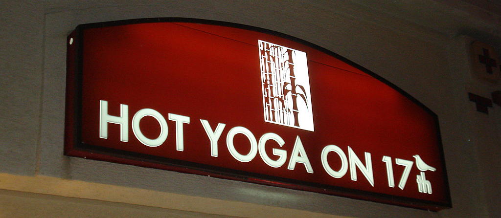
Tell the world who you are! Ever gone by a sign and wondered, “Geez, what do they do?” For certain businesses, there may be some mystery they want to evoke, but vagueness is a real hindrance for the vast majority of companies. The two primary elements are the business name and logo. Obviously, when you design your signage you should have these two elements solidified. But if for some reason your name and logo do not really convey what it is you do, consider a tagline or imagery that further clarifies the message. A sign is a true opportunity to bring in new traffic. Even if your business is a sophisticated consulting firm or highly specialized technical service, you never know who could be walking by, and whether they have friends or family members who might fit within your precise target market.
 Colour
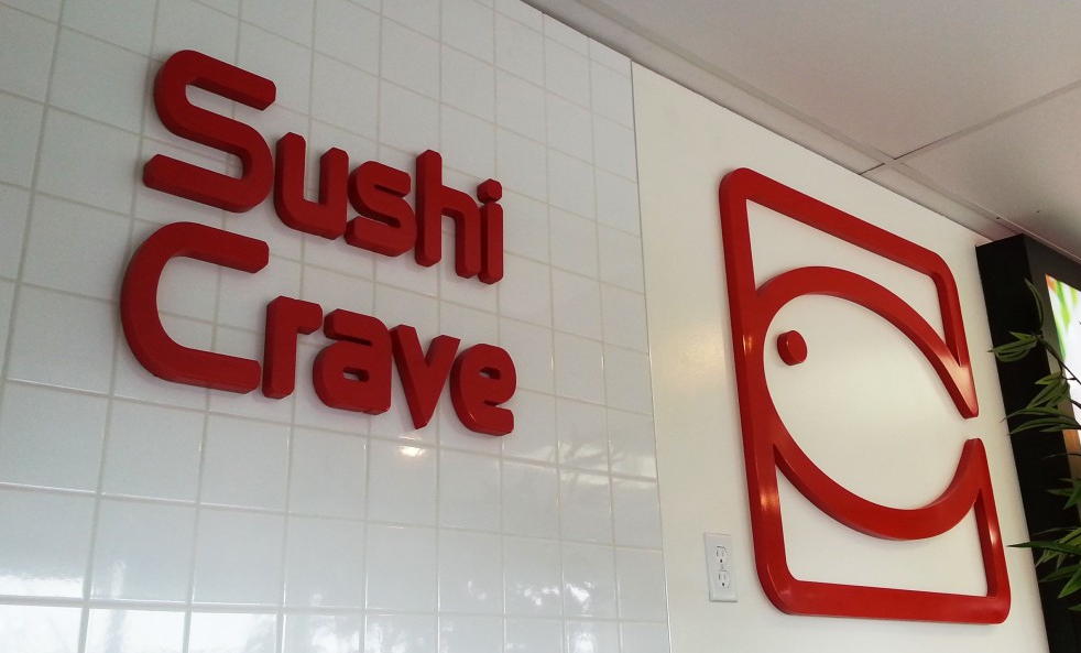
Choose your colours carefully. Your colour choice will help your commercial sign get noticed, read and remembered. Give some careful thought to what colours fit your business’ brand and what will be noticed from across the street. A poor colour choice can make it difficult to read your sign or even notice it in the first place, while compelling colour is integral to brand identity– think of Coca-Cola red & white, or McDonald’s golden arches. On the other hand, if you have a logo that just doesn’t read well, or a corporate colour scheme that won’t lend well to your sign, you might consider doing a natural treatment (e.g. wood or metallic) or converting your sign into black and white.
Another important consideration: trendy colours. Some business owners may feel compelled to convey their personality via signs that use current, edgy colour trends, but care should be taken to consider longevity when designing static signage. Today’s “colour of the year” could be tomorrow’s eyesore.
 Contrast
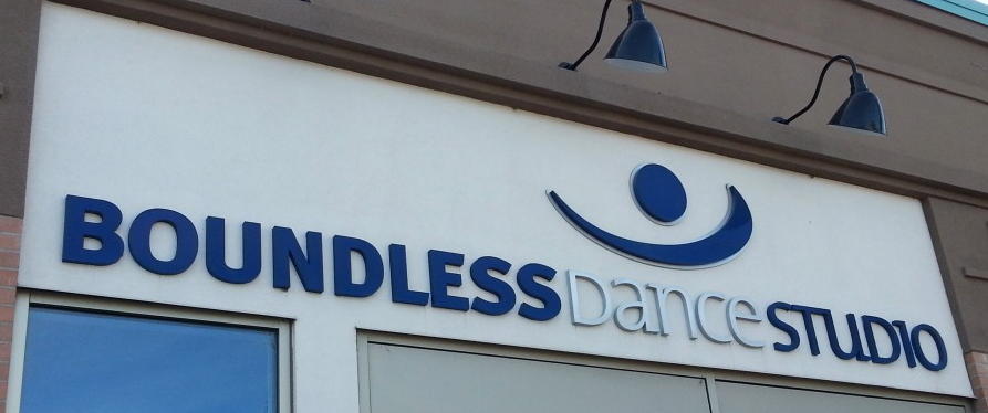
Apart from colour, a sign’s contrast will usually determine its readability and is a huge factor in engaging the attention of passersby. Contrast refers to the difference between light and dark, and this can be dramatically affected by how the sign is lit and placed on its intended background.
Most signs will include either text or graphics in the foreground, with a continuous background colour. Contrast between these two elements is critical to the viewer’s retention of the content. Pairing similar colours will decrease a sign’s readability, but a weak colour contrast can be strengthened with outlines, drop shadows around the foreground elements, or lighting. The reflective properties of the chosen materials must also be considered.
Font Choice
As we’ve mentioned recently, a clear and simple statement can be rendered ineffective with a poor choice of font. Pick out a font type that is easy to read, and consider the distance from which passersby are likely to see the sign. Steer clear of font types that are difficult to see from a distance, and make sure the size of your font is large enough to read.
 Graphics and Images
A key asset to a commercial sign is beautiful eye-catching graphics and images. Pairing graphics and/or images with your main message can instantly bring focus to the product or service you’re offering. Your image should also be a size that can be easily seen and identified from a distance, and not weave in so closely to the text that it confuses text with image.
Size
Simply put, the larger the letter, the easier it is to read. We almost always recommend using the biggest sign your landlord or municipality will allow. After all, it is a billboard, right at your location, for which you need not pay monthly fees!
The size of your sign is especially important if you’re creating roadside signage or signs that will be displayed at a significant distance. A good rule of thumb is ten feet per inch of letter height. Say you have lettering that is one inch high and clearly legible at a distance of ten feet; at a distance of 100 feet the lettering would have to be 10 inches high to achieve the same impact.
Placement
Just like font, type size and image size, you should think about where your sign is being placed. You may already be working with strict size specifications. If not, make sure your commercial sign is large enough to get noticed and to accommodate all your design elements (i.e. name, logo, headline, graphics, etc.).
Conclusion
In this technology-centred world, we’re often talking about advertising and marketing online and especially over mobile phones. But when it comes to really grabbing people’s attention with immediacy, sometimes a real, physically impressive, solid sign can be your best bet. It says, “we’re here in the flesh” and helps to build customer trust, so it’s worth getting right.
Extensive design experience is just one reason Topmade is Calgary’s leading full-service sign manufacturer. Give us a call today!


 Message
 Colour
 Contrast