How to Choose a Colour Palette for Your Sign

Added on 31 January 2017
By TopMade
0 Comments
In our last blog, we talked about typography and how your font choice can impact your sign’s legibility, as well as its visual appeal. Today we’re going to explore an equally important design element – colour.
Artists can spend years exploring how to expertly manipulate the power of colour. But if a career in the fine arts isn’t part of your life plan, don’t worry. By reviewing a few key concepts of basic colour theory, you will be able to make more informed decisions about an integral aspect of your sign’s design. And, if you’re working with a graphic designer, having a good grasp on design vocabulary can work wonders to reduce the revision process.
The Power of Colour
When we appreciate great signs, we tend to focus on the clever wording or the neat imagery. In comparison, as long as the sign isn’t hurting our eyes, we might not actively pay much attention to the colour choices. However, that does not mean colour should be underestimated. Its true power rests in how it subconsciously makes us feel.
Due to cultural, historical, or personal associations, colours have multiple meanings and can elicit strong responses. For example, in Europe and North America, purple represents royalty and riches. But why is that? Until 1856, purple dye was very difficult and costly to make. Soon, purple fabric became a symbol of the wealthiest class. When Cadbury, a chocolate company located in the UK, uses purple as a packaging colour, they’re sending a clear message to their consumers: Cadbury chocolate is rich, high quality, and decadent.
At the same time, purple can mean something very different in other parts of the world. In Brazil, for instance, purple is worn with black when mourning. So if you’re planning to expand your business globally, it might be worthwhile to investigate the various meanings of your chosen colours thoroughly before using them.
For a comprehensive guide to the meaning of colours in different cultures, check out this infographic by Information is Beautiful.
In short, colours are imbued with meaning. They are also a useful tool when planning your design’s composition. A carefully chosen colour, like a bright yellow against a backdrop of greys, can balance an asymmetrical design or guide the viewers eyes along a predetermined path.
Basic Colour Terminology
- Hue is the name of a colour.
- Saturation is the intensity of a colour. A vivid colour has a high saturation, while a dull colour is desaturated.
- Brightness is how light or dark a colour is.
- In addition to portraying specific meanings, colours can also feel warm, neutral and cool. Warm colours, like red, appear to pop in a composition whereas cool colours, like blue, recede.
The Colour Wheel and Colour Harmonies
Choosing one colour might not seem intimidating, but how do you decide on an appealing palette of two or three? In general, it’s best to keep colour combinations simple. This means there should be a primary colour – think Home Depot’s orange or Snapchat’s yellow – followed by a few, less dominant, accent colours.
For these difficult decisions, we often rely on a colour wheel. Using the colour wheel, you can easily identify sets of colours that work well together. These successful colour relationships are referred to as “colour harmonies.”
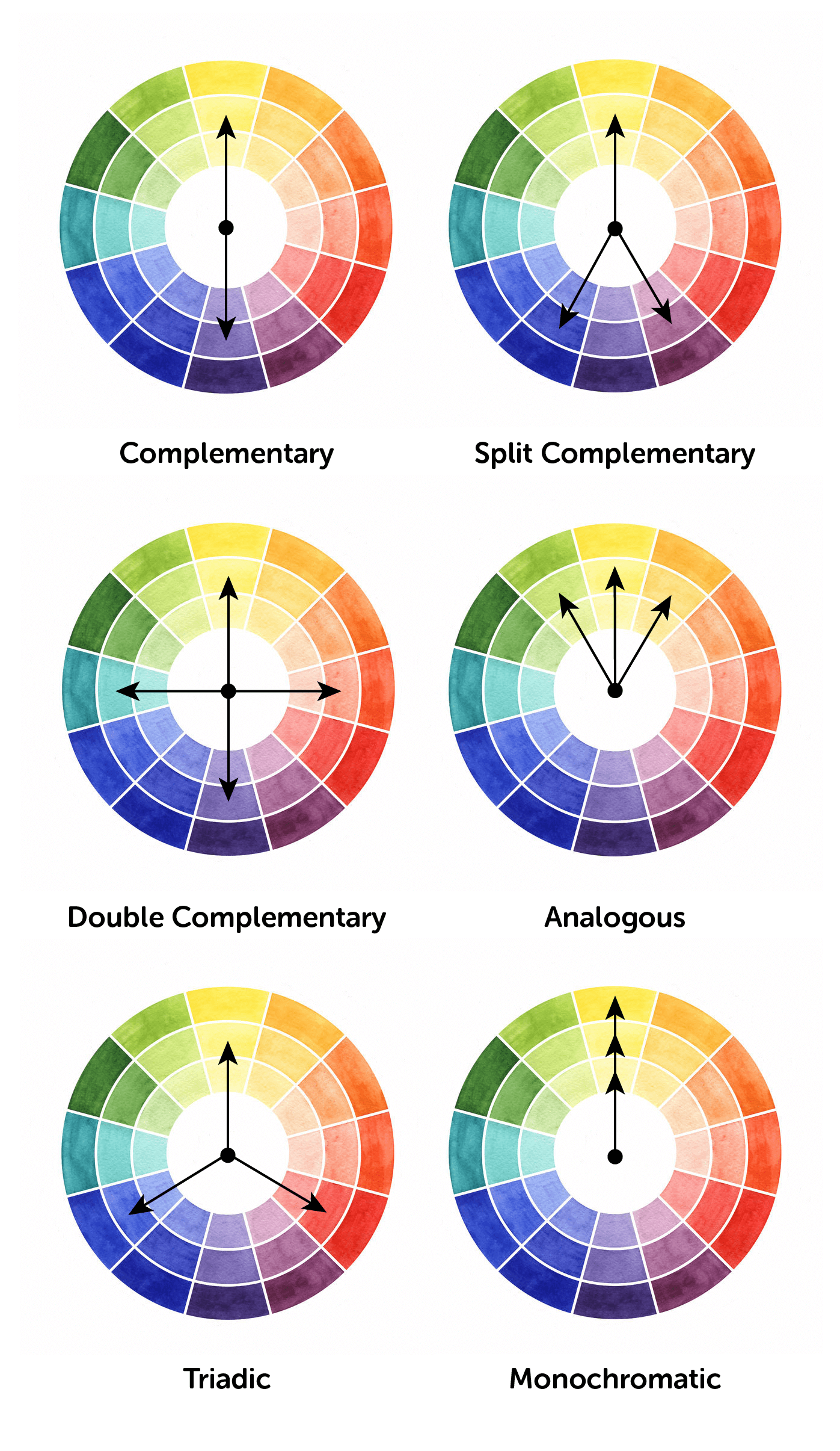
- Complementary: Two colours that are opposites on the colour wheel. These colours will have a strong contrast with each other and the result is dramatic.
- Split Complementary: Like complementary but a little subtler. A primary colour is picked and the two supporting colours will be adjacent to the complementary colour of the primary.
- Double Complementary/Rectangle: 4-colour combination that consists of two complementary pairs. Because this colour scheme features a lot of contrasts, set one colour as the primary, and use the secondary colours sparingly.
- Analogous: Two or more colours that are beside each other on the colour wheel. The colours are similar; so, it creates a soothing and natural combination.
- Triadic: Three colours that are spaced evenly around a colour wheel. This variety in colour leads to a vibrant colour combination. To tame the results, two of the colours should be used sparingly.
- Monochromatic: Varieties of saturation and lightness of a single hue are used to create a colour scheme.
Colour harmonies are a great way to form a pleasing visual but don’t be afraid to break the “rules” when it suits the goal of the design. For example, if you’re hoping to disrupt the status quo with your sign, deliberately choosing discordant colours can shock and excite the viewer.
If you’re not sure where to start, colourlovers.com is a great online resource. You can browse their large library of community-made colour palettes for inspiration.
Colour and Your Brand
Designing your company’s sign is a great opportunity to really consider how colour can play a major role in your brand strategy. Once you’ve decided on a colour palette that supports your company’s message and tone, why not set down some brand guidelines? Ensuring colour consistency across the rest of your print materials will speed up future design projects and project a professional image.
We hope that this discussion in colour theory has been helpful and, if you’d like further guidance, Topmade offers expert signage consulting to help you decide what kind of sign is right for you.
Additional Sources:
- Stone, T. L., Adams, S., & Morioka, N. (2006). Color design workbook: A real-world guide to using color in graphic design. Gloucester, Mass: Rockport Publishers.