Commercial Signage Tips

Added on 20 February 2017
By TopMade
0 Comments
You want your sign to Attract, Direct and Inform your target audience. It is a message to the world; be sure it gets noticed. Who hasn’t been driving down the street, stopped at a store and made a purchase, merely because they noticed the sign?
Once you’ve decided what you want to say, there are a few things you should reflect on before you visit Topmade. Here are some considerations in designing a great commercial sign.
Strategy
Be aware of your competitors’ marketing strategy and try to make yours distinct. Your sign is often the first impression of your brand– whether luxury, budget conscious, high-tech or otherwise. If you allow your business to look like a carbon copy of another business, then you’re subtly telling people you’re a lesser version of the original.
 Message
Tell the world who you are! Ever gone by a sign and wondered, “Geez, what do they do?” For certain businesses, there may be some mystery they want to evoke, but vagueness is a real hindrance for the vast majority of companies. The two primary elements are the business name and logo. Obviously, when you design your signage you should have these two elements solidified. But if for some reason your name and logo do not really convey what it is you do, consider a tagline or imagery that further clarifies the message. A sign is a true opportunity to bring in new traffic. Even if your business is a sophisticated consulting firm or highly specialized technical service, you never know who could be walking by, and whether they have friends or family members who might fit within your precise target market.
 Colour
Choose your colours carefully. Your colour choice will help your commercial sign get noticed, read and remembered. Give some careful thought to what colours fit your business’ brand and what will be noticed from across the street. A poor colour choice can make it difficult to read your sign or even notice it in the first place, while compelling colour is integral to brand identity– think of Coca-Cola red & white, or McDonald’s golden arches. On the other hand, if you have a logo that just doesn’t read well, or a corporate colour scheme that won’t lend well to your sign, you might consider doing a natural treatment (e.g. wood or metallic) or converting your sign into black and white.
Another important consideration: trendy colours. Some business owners may feel compelled to convey their personality via signs that use current, edgy colour trends, but care should be taken to consider longevity when designing static signage. Today’s “colour of the year” could be tomorrow’s eyesore.
 Contrast
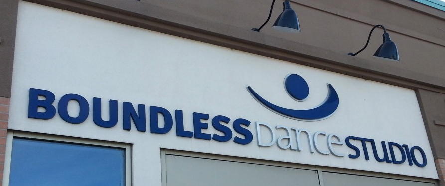
Apart from colour, a sign’s contrast will usually determine its readability and is a huge factor in engaging the attention of passersby. Contrast refers to the difference between light and dark, and this can be dramatically affected by how the sign is lit and placed on its intended background.
Most signs will include either text or graphics in the foreground, with a continuous background colour. Contrast between these two elements is critical to the viewer’s retention of the content. Pairing similar colours will decrease a sign’s readability, but a weak colour contrast can be strengthened with outlines, drop shadows around the foreground elements, or lighting. The reflective properties of the chosen materials must also be considered.
Font Choice
As we’ve mentioned recently, a clear and simple statement can be rendered ineffective with a poor choice of font. Pick out a font type that is easy to read, and consider the distance from which passersby are likely to see the sign. Steer clear of font types that are difficult to see from a distance, and make sure the size of your font is large enough to read.
 Graphics and Images
A key asset to a commercial sign is beautiful eye-catching graphics and images. Pairing graphics and/or images with your main message can instantly bring focus to the product or service you’re offering. Your image should also be a size that can be easily seen and identified from a distance, and not weave in so closely to the text that it confuses text with image.
Size
Simply put, the larger the letter, the easier it is to read. We almost always recommend using the biggest sign your landlord or municipality will allow. After all, it is a billboard, right at your location, for which you need not pay monthly fees!
The size of your sign is especially important if you’re creating roadside signage or signs that will be displayed at a significant distance. A good rule of thumb is ten feet per inch of letter height. Say you have lettering that is one inch high and clearly legible at a distance of ten feet; at a distance of 100 feet the lettering would have to be 10 inches high to achieve the same impact.
Placement
Just like font, type size and image size, you should think about where your sign is being placed. You may already be working with strict size specifications. If not, make sure your commercial sign is large enough to get noticed and to accommodate all your design elements (i.e. name, logo, headline, graphics, etc.).
Conclusion
In this technology-centred world, we’re often talking about advertising and marketing online and especially over mobile phones. But when it comes to really grabbing people’s attention with immediacy, sometimes a real, physically impressive, solid sign can be your best bet. It says, “we’re here in the flesh” and helps to build customer trust, so it’s worth getting right.
Extensive design experience is just one reason Topmade is Calgary’s leading full-service sign manufacturer. Give us a call today!
