Design Rules for Signage: A Universal Approach

Added on 16 May 2016
By TopMade
0 Comments
A Welcome Sign: A Universal Design Approach
Your customers are as unique as your business, and it’s important to ensure that they have a great experience when they visit. This includes providing information in a way that’s accessible to your diverse clientele – who vary in age, size and ability. Unfortunately, a lot of our built environment is not welcoming to many. For example, when a sidewalk lacks a curb ramp, then people who are using a wheelchair, stroller, bicycle or crutches are negatively impacted.
Universal design, which evolved from accessible design, is based on the principle that design should be functional and engaging for everyone. As signage is a key component in how we navigate spaces effectively, and communicate important messages, it plays a major role in successful universal design. If you’re retrofitting your business to be more inclusive, or starting fresh, here are some things to keep in mind to improve your signage.
“Universal Design: products and environments created to be usable by all people, to the greatest extent possible, without the need for adaptation or specialized design.” Ron Mace, Centre for Universal Design (2007).
Keep content clear and consistent.
- A lot of the tips we discussed with directional signage are relevant to universal design. For instance, write in short sentences and avoid unnecessary industry-specific jargon.
- Use a sans-serif font, like Helvetica, and avoid “ALL UPPERCASE” text.
- Maintain a high color contrast between font and background for optimum clarity.
- Minimize visual noise. Too many images spaced closely together can be distracting or influence your sign’s legibility.
- If you order additional signs, do not change the meaning of any colors or symbols used unless you update your older signs to match.
Use multiple modes of communication.
- The addition of universal symbols, graphic elements, and clear language on your signs, accommodates a range of literacy and language skills.
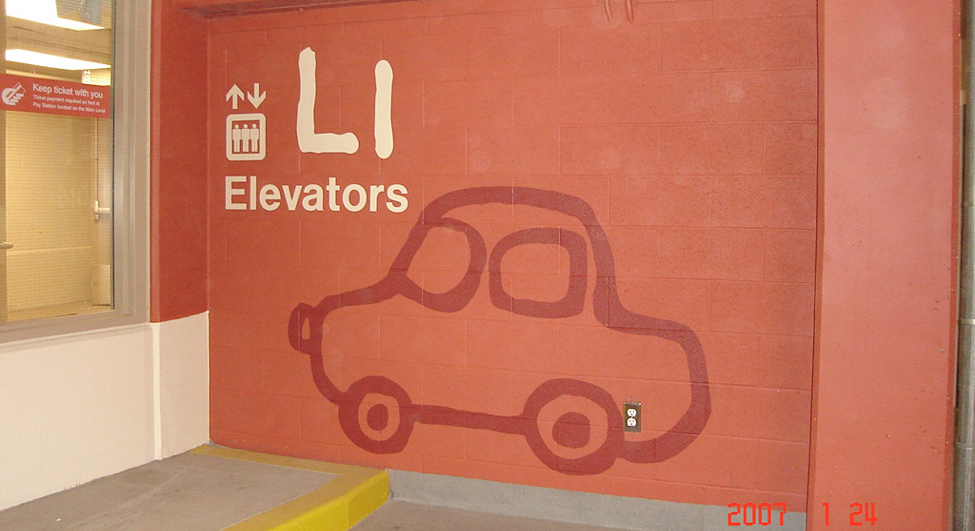
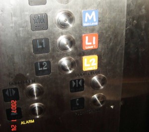
- As mentioned in The City of Calgary’s Universal Design Handbook, people rely on and prefer different cues for information recall. If you’re designing a directory board, map or parking lot signs, designate colors or symbols along with numbers. Keep this formatting consistent throughout the rest of your signs to avoid confusion.
- Color Universal Design (CUD) suggests that if your signs use colors as a meaningful design element, make sure to provide this information in another way as well. This guarantees it’s perceivable to people with colour-vision impairments. As an example, for a park map, different trails can be marked by types of dotted lines/shapes along with colors.
- Provide tactile information on signs, such as raised letters and braille. Museums, like the National Museum of American History, also utilize audio with their interpretive signs. This is done via the displays or it’s delivered through a downloadable app. For people with a visual impairment, apps offer the additional benefit of voice recognition, screen readers, integrated GPS systems, and screen magnification software.
To learn more about how the National Museum of American History is using a universal design approach with their signs, check out this article.
Pay attention to the environment.
- Precautions should be taken to avoid glare. The Center for Inclusive Design and Environmental Access proposes low glare lenses as a possible solution. Material choices and finishes can also greatly affect glare.
- There should be a clear line of sight to your sign, whether the user is standing or sitting. Additionally, signs created for pedestrian use, like maps, should be tilted so they are functional for people of all statures, whether standing or seated.
- Prevent visual cluttering in the environment by keeping the number of signs in an area at a minimum. Try to group information logically into a couple of signs, if necessary.
Keep your signs updated.
- Users rely on your signs to be correct. A printout taped over your sign, for instance, is only providing the new information to a portion of your customers.
For more details on universal design, such as recommended height and spacing of signs, take a look at the Universal Design Handbook by The City of Calgary.
Universal design is a complex and exciting topic. And we’ve only scratched the surface! Need more professional insight? Give us here at Topmade a call, we offer expert signage consulting to help you decide what kind of sign is right for you.

Sources:
