Direct Traffic with Inviting Pylon and Monument Signs

Added on 18 August 2016
By TopMade
0 Comments
In a busy business park, it’s not uncommon for your store to be obstructed from the view of nearby traffic. For instance, there could be a large parking lot, or other businesses, located between your storefront and the road. If that’s the case, you can’t just rely on a sign above the door or else you’ll miss out on potential customers. This includes people who live nearby, who can become regulars, and impulse shoppers passing by. So what can you do to let people know about your business?
That’s where pylon and monument signs come in. As their name suggests, these freestanding outdoor signs are built to last, thanks to a strong base and the use of quality materials.
When deciding on a monument or pylon sign, be sure to consider:
The perfect size. For example, a pylon or monument sign should be taller than any nearby obstructions, like trees or parked cars. And, of course, check with the City on any applicable size restrictions.
The right position. Before purchase and installation of your sign, be aware of your property lines. It would be a shame to put in all that work, only to get in trouble once you find out it’s not your land!
For some beautiful and historic examples of pylon and neon signs, watch this video by Travel Thru History on the Neon Museum and the rescued vintage signs from the Vegas Strip. According to the Neon Museum, the Stardust roadside pylon sign was considered the tallest sign in the world for a decade after its creation. Talk about show-stopping!
Pylon signs are like a bold flag in the distance, letting people know where you are.
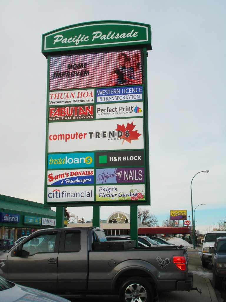
Pylon signs are also known as roadside, highway or pole signs. They are taller than monument signs and are often placed near the road with the goal of attracting visitors at a distance. Because they only have a moment to catch interest, pylon sign design needs to account for the time required for drivers to detect the sign, read it, and react accordingly. Bottom line, pylon signs should display only basic information for quick comprehension. Usually a business name or well-known logo and, maybe, a tag line.
But while pylon signs can be simple content-wise, they can also incorporate elaborate custom shapes, double-sided visuals, illumination and updatable digital boards.

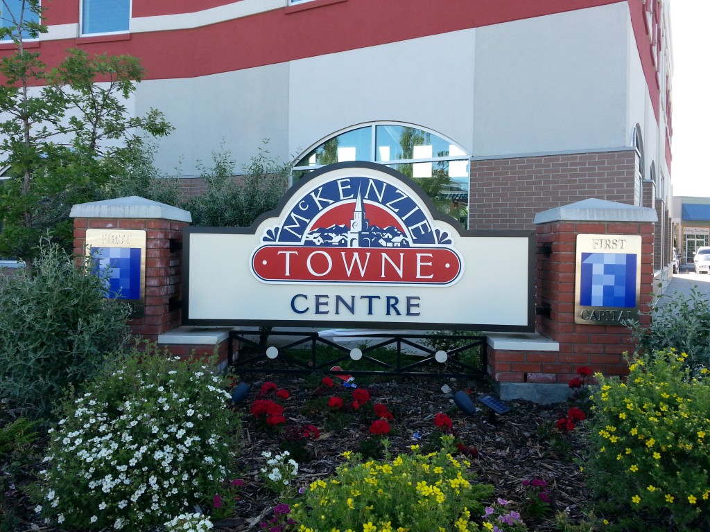
Monument signs are like an attractive welcome mat, assuring customers they’ve reached the right place.
Monument signs are commonly shorter than pylon signs – about eye-level with a wide base. They are aimed at slower moving, approaching traffic to act as a directional marker. As an example, if you look at large campuses, which can be confusing to navigate, monument signs help visitors identify approaching buildings.
Based on its design, monument signs also give you a clue as to what to expect from a business. If it’s made of aluminum with hard edges, you might guess that the company is related to technology or offers state-of-the-art services. An engraved stone or wood monument sign, surrounded by beautiful landscaping, signals a more relaxed or calm space. A friendly suburb, perhaps, or a golf course.
Pylon and monument signs can also work together to attract visitors to your business.
Unique when compared to many other signs, pylon and monument signs might contain information for multiple businesses. In this case, the pylon or monument sign will complement the aesthetic of the overall shopping centre, rather than your business specifically. Under these circumstances, there are a few additional design elements you must consider, in order to stand out from your neighbours with such limited space.
Use negative space. Due to a number of logos competing for dominance in a relatively smaller area, negative space becomes increasingly important. You may be tempted to blow up your logo as much as possible, but, trust us, leaving some breathing room will go a long way. It will act as a nice frame around your logo and it will be more legible at a distance.
Switch up the background colour. If all the other businesses on the pylon sign are submitting their logos on white backgrounds, why not have yours on a solid colour background? It will really pop in comparison. However, make sure that your logo is still easy to read and that the colour matches your branding.
Take advantage of positioning (if you can). As we discussed in our article on designing menu boards, our eyes follow a particular pattern when reading different types of signs. The decision may be out of your hands, but the ideal spot on a pylon sign would be the top-left.
Bigger is better. Again, you may not have much flexibility here. But, if you can secure a larger spot on the sign, you will have a better chance of gaining attention. Or, if an extra spot opens up, see if you can claim it too. You can use it to bolster your logo with a coordinating call to action sign.
For more details on ideal height, size and position for pylon and monument signs, check out this helpful guide by the United States Sign Council. Or give us here at Topmade a call. We offer expert signage consulting from design to installation.
