8 Tips for Creating an Appetizing Menu Board
Added on 29 February 2016
By TopMade
0 Comments
We’ve already discussed how important an outdoor business sign is to gain the attention of a potential customer. But, if you’re a restaurant owner, how do you impact whether a customer makes a purchase once they’re in your establishment? Or, how do you turn a one-time customer into a loyal patron?
For many, the menu board is a key tool for creating a positive customer experience that leads to increased sales and efficiency during the order process.
Certain menu board types, such as back-lit menu signs, allow you to customize the entire piece to align strongly with your brand. Others, like chalkboard signs, are ideal for making quick changes. Digital signs offer these previous benefits, along with the potential for interesting animation.
In general, to create a winning menu board, you should determine a strategy and then a design.
- Stage 1: Strategy
Consider your layout options. For example, should your menu board be a series of portrait oriented boards or one big horizontal board? This decision may be determined by space requirements but also by how you want to structure your information.
Give your stars top billing. Research on tracking eye movements indicates that certain areas of a menu are prioritized over others. For indoor use, the center of a menu board is prime real estate. Therefore, you should dedicate this space to best-sellers or new promotions.
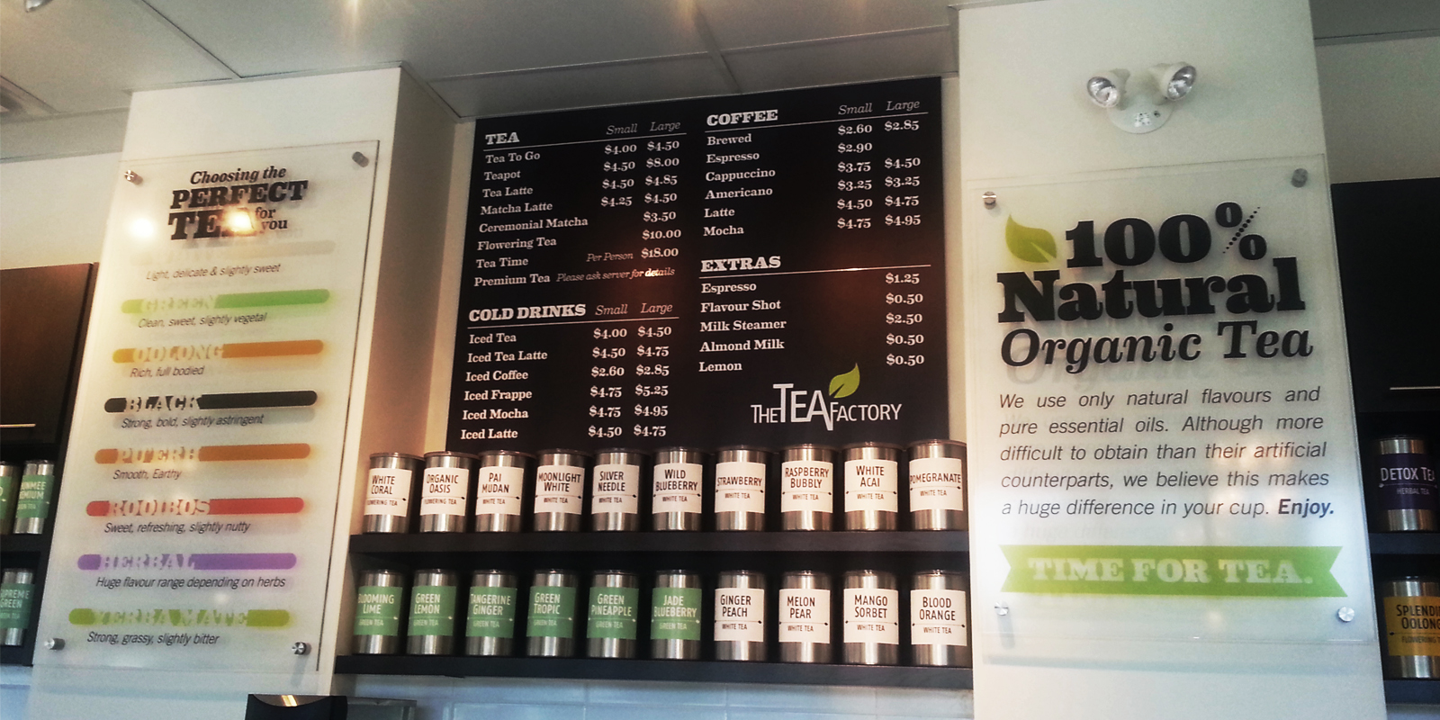
Organize content into categories. While creativity is part of the process, certain conventions are essential to ensure readability. For instance, foods should be grouped by type and clearly defined columns and rows allow for related information to be presented in a logical fashion.
Prepare the space. Make sure ample lighting is provided and that the menu board is placed in an ideal location. If a customer can only see the menu board when they’re at the till, a lineup bottleneck can occur as they try to figure out what they want.
- Stage 2: Design
Set the stage. Unless the customer is already a regular, you’re pretty much guaranteed that they will be checking out your menu board. This is your opportunity to communicate the tone of your restaurant. Through the consistent use of colours, imagery and fonts, you can create a strong impression on your customers, so they want to come back.
Some common design elements to keep in mind are:
Hierarchy: High level information, such as categories or special promotions, should stand out to help customers find the information quickly. This can be done by using different fonts or colours or by making the text larger or bolder. Borders, images and icons are another way to highlight certain areas.
It’s important that any images used reliably reflect your product, and are of good quality, so the customer walks away happy with their purchase.
Balance: While you may want to prioritize one section over another, you also don’t want any part of your sign to be ignored. If you’re using images, for example, place them carefully throughout your menu board, so the customer’s eye is drawn across the layout.
Readability: If the letter-size is too small, or there isn’t enough space between text or visual elements, your customers will have a difficult time reading your sign. At best, this can slow down the line and, at worst, the the customer can get frustrated and leave. Either way, there is a negative consequence for your business. For tips on improving sign visibility, check out our previous blog.
A menu board is an integral part of a restaurant’s sales strategy. If you’d like expert guidance on how to create a design that will help you meet your business goals, give us here at Topmade a call.