Added on 11 March 2014
By TopMade
0 Comments
There are some best practices when choosing letter height for maximum visibility. The United States Sign Council has published quite a technical study on the subject that we recommend you use as a complete reference guide to signage, as well as a sign legibility guide.
They provide an interesting 10-step calculation method as follows, that accounts for speed of travel, viewing distance, and viewer reaction time. There is also a lookup table to estimate viewer reaction time based on speed of travel and size of sign.
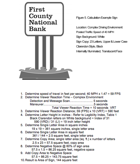
For more on this calculation method, CLICK HERE to view the whole study.
With this in mind, we have one final thought – we recommend to always get the largest sign you can afford or that your landlord will allow. Prominent signs always maximize your brand awareness and walk-in traffic.
Contact Us today to assist you in ordering your sign.

Added on 6 January 2014
By TopMade
0 Comments
There are no hard and fast rules about positioning your sign, but we’ve put our heads together to give you a few insights:
- Are customers walking or driving? If customers are walking in a mall or an outdoor shopping area, you will need signs at eye level, on any doors/ windows (avoid the “which is the right door?” problem), and if the sidewalk is narrow, perpendicular to oncoming foot traffic. You can also try sandwich boards if they do not block foot traffic, and if allowed in your community shopping area. If your location will be viewable by driving traffic, ensure it is viewable (preferably perpendicular) to traffic in both directions and is within eye-lines of both trucks and cars (up to height of traffic lights generally best).
- Where will customers likely have to park? If customers are likely to park far away from your store, consider signs that lead them to you and encourage them to visit you. These might be in an elevator, or walkway, or food court near you. Ensure you appear correctly in any directory panels or electronic directory board categories in which you qualify. Consult your landlords to see what is appropriate and allowable.
- How will they navigate in-store? Once in your store, customers must easily be able to get a “lay of the land.” Include a directory at the entrance if you have lots of departments/features, or easily visible signage categorizing your merchandise for ease of location. If you expect people to shop for longer periods of time, include directional signage for washrooms. If you expect line-ups, ensure you have signs to direct people. Of course, ensure exits are marked for safety, and doors for direction of opening.
Here are a few examples:

Driving customers need to see signs from access roads.
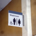
Washroom signs need to be overhead, and perpendicular to walking traffic.
Remember – visibility is the key – and it may take years until you perfect it within your location. Do your best, keep optimizing, and we’ll be there to assist you every step of the way.
Any more thoughts on where to position signs? CONTACT US – we’d love to assist you.
Added on 4 January 2014
By TopMade
0 Comments
Signage generally serves one or more functions: to attract, direct or inform. Great signage does enough of all three functions, making your customers feel interested and secure enough to be comfortable buying from you.
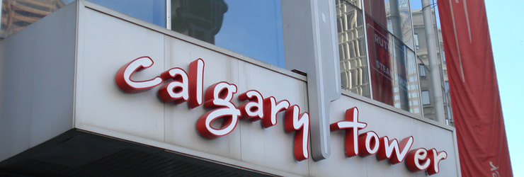
- Attract – Without considering what the sign says – the sign should be appealing and eye catching. Lighting, colour, size and position height should maximize visibility. Remember, the image or graphic will set the personality of the business. Consider these example signs:


- Direct – The sign should show people how to access your business. If you have a shop around the back of a building, tell people how to get at it. Include further directional signs for any elements the customers may be seeking – the washrooms, the exit door, the nursing room, the parking lot, the elevators, the stairs, and of course, signs that help to segment your product lines into intuitive groupings. The following are some ways to do this:
- By Brand – only use this is the brand is actively known and sought by customers. Sign should carry the Brand’s logo to enhance recognizability.
- By Purpose – for example, all cooking utensils together. Sign should describe the category “Cooking Utensils”
- By Customer Type – for example, kids toys together. Sign should describe customer “For Kids”
- Inform – Signs should help the customers make decisions, and be clear in their usage. The offer a great opportunity to sell when salespeople are not present. For example:
- Discounts: “All winter merchandise – 40% off”
- Products: “100% wool, made in Canada.”
- Add-ons: “Inquire about our catering services.”
- Cross-Promotion: “Visit us online at www.topmade.com or on twitter @topmade”
There is a balance between proper signage use and looking too “salesy” – and it truly depends on the kind of brand you desire.
We strongly recommend working with a professional graphic designer to develop your logo and brand guidelines prior to developing your signage. This will help to keep your brand consistent and meaningful to your audience, and help your signs to attract, inform and direct the right customers to your door.
Have any further questions about signage? CONTACT US today.


