Added on 16 May 2016
By TopMade
0 Comments
A Welcome Sign: A Universal Design Approach
Your customers are as unique as your business, and it’s important to ensure that they have a great experience when they visit. This includes providing information in a way that’s accessible to your diverse clientele – who vary in age, size and ability. Unfortunately, a lot of our built environment is not welcoming to many. For example, when a sidewalk lacks a curb ramp, then people who are using a wheelchair, stroller, bicycle or crutches are negatively impacted.
Universal design, which evolved from accessible design, is based on the principle that design should be functional and engaging for everyone. As signage is a key component in how we navigate spaces effectively, and communicate important messages, it plays a major role in successful universal design. If you’re retrofitting your business to be more inclusive, or starting fresh, here are some things to keep in mind to improve your signage.
“Universal Design: products and environments created to be usable by all people, to the greatest extent possible, without the need for adaptation or specialized design.” Ron Mace, Centre for Universal Design (2007).
Keep content clear and consistent.
- Use a sans-serif font, like Helvetica, and avoid “ALL UPPERCASE” text.
- Maintain a high color contrast between font and background for optimum clarity.
- Minimize visual noise. Too many images spaced closely together can be distracting or influence your sign’s legibility.
- If you order additional signs, do not change the meaning of any colors or symbols used unless you update your older signs to match.
Use multiple modes of communication.
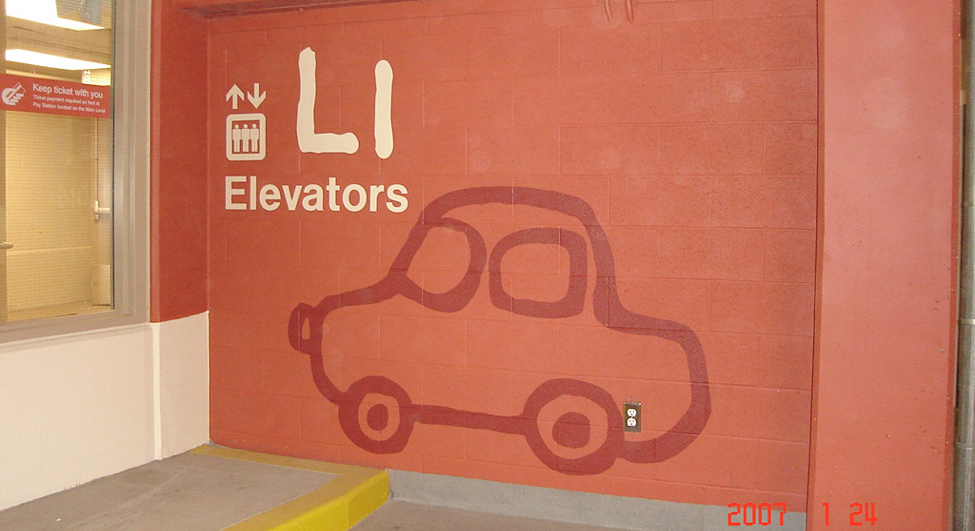
- The addition of universal symbols, graphic elements, and clear language on your signs, accommodates a range of literacy and language skills.
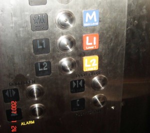
- As mentioned in The City of Calgary’s Universal Design Handbook, people rely on and prefer different cues for information recall. If you’re designing a directory board, map or parking lot signs, designate colors or symbols along with numbers. Keep this formatting consistent throughout the rest of your signs to avoid confusion.
- Color Universal Design (CUD) suggests that if your signs use colors as a meaningful design element, make sure to provide this information in another way as well. This guarantees it’s perceivable to people with colour-vision impairments. As an example, for a park map, different trails can be marked by types of dotted lines/shapes along with colors.
- Provide tactile information on signs, such as raised letters and braille. Museums, like the National Museum of American History, also utilize audio with their interpretive signs. This is done via the displays or it’s delivered through a downloadable app. For people with a visual impairment, apps offer the additional benefit of voice recognition, screen readers, integrated GPS systems, and screen magnification software.
To learn more about how the National Museum of American History is using a universal design approach with their signs, check out this article.
Pay attention to the environment.
- There should be a clear line of sight to your sign, whether the user is standing or sitting. Additionally, signs created for pedestrian use, like maps, should be tilted so they are functional for people of all statures, whether standing or seated.
- Prevent visual cluttering in the environment by keeping the number of signs in an area at a minimum. Try to group information logically into a couple of signs, if necessary.
Keep your signs updated.
- Users rely on your signs to be correct. A printout taped over your sign, for instance, is only providing the new information to a portion of your customers.
For more details on universal design, such as recommended height and spacing of signs, take a look at the Universal Design Handbook by The City of Calgary.
Universal design is a complex and exciting topic. And we’ve only scratched the surface! Need more professional insight? Give us here at Topmade a call, we offer expert signage consulting to help you decide what kind of sign is right for you.

Sources:

Added on 29 April 2016
By TopMade
7 Comments
We touched briefly on engraving in our blog on the natural charm of wooden signs. But we felt that, as an artistic process with such a long history, engraving deserved its own dedicated post.
Engraving refers to a number of techniques where a design is created by cutting into a hard surface such as metal, stone or wood. In the past, it would take a long time to complete a project because the work had to be done by hand. Today, skilled craftspeople are assisted by machines. This allows for complex designs to be faithfully and efficiently reproduced. For example, a CNC machine or laser produces finely detailed work. Another method, sandblasting, shapes a surface by, well, blasting an abrasive substance against it. It’s highly suited for achieving letter depth and can generate a carved/textured look.
As a design choice, engraving adds subtle dimension to a sign. Its understated sophistication is perfect if you want a professional appearance but are on a limited budget. In addition, it serves equally well as the main visual style of a sign, or as a decorative motif. To help the design pop further, the letter impressions can be painted or a foil can be applied.
While a popular choice for business signs and information boards, engraved signs have a lot of non-commercial uses as well, including:
- Memorial plaques
- Awards
- Custom house number signs
- Garden accents
What are the benefits of an engraved sign?
- A meaning “carved in stone.” Wood, metal and stone are elements of nature that signify longevity. Engraving a personal message into these materials for an award, for example, symbolically pays homage to the lasting impact of the recipient. For a business, the solid appearance of carved natural materials creates an impression of strength.
- Your pick of materials. Engraving is a technique that can be used with a wide variety of materials. This flexibility is advantageous, as each design choice for your sign should reflect your brand. For instance, a brass sign presents a traditional image whereas a stainless steel sign is more modern.
- Ideal for small projects. Really proud of your home? Share that pride with a custom home address marker. Need to boost employee morale? Honor your team with a personalized trophy for achievement. Engraved signs and plaques are an easy, lasting and meaningful way to celebrate places, moments, and people in your life.
Need professional insight about incorporating engraving into your signs? Give us here at Topmade a call. We offer expert signage consulting to help you decide what kind of sign is right for you.

Added on 11 April 2016
By TopMade
0 Comments
Directional signs might not be top-of-mind when contemplating creative signage, but an immense amount of consideration goes into their design. That’s because they’re integral to navigating through our environment efficiently. While good design can help create a seamless, enjoyable journey through a nature park, bad design can lead to someone missing their flight or, worse, the turn-off to the hospital. As a result, it’s important for transportation services, municipalities and businesses to get it right when developing their directional signage.
Advantages of good directional signs include:
- Reduced travel time.
- Increased accessibility.
- Improved user experience.
- Boosted revenue due to improved user experience.
- Enhanced brand awareness.
When designing directional signs, remember:
- Consult design best practices. We’ve discussed general design guidelines on previous blogs, but what sets directional signs apart is their focus on clarity and consistency. For example, directional signs at airports or subways stations often use fonts that have a steady thickness throughout. These fonts are easier to read at smaller sizes than ones that have thick and thin areas. Overall, you want users to be able to glance at your sign and glean information from it quickly.
- Keep it simple. Only include information that is necessary, and do so in short sentences. Avoid insider terminology or confusing jargon if your signs will be used by the general public. In addition, if you have a digital sign system, avoid excessive animations as they can be distracting and hard on the eyes.
- A picture’s worth a thousand words. Universally understood symbols allow us to communicate visually in a way that transcends language and cultural barriers. Symbols can also be seen from a distance, which is helpful in emergencies.
- There’s strength in consistency. Take time to decide on imagery, colors, fonts and a visual hierarchy that will be used on your directional signs. (And make sure these choices are adhered to when ordering new signs). This serves a couple of purposes:
- It’s an opportunity to carry your branding into your signage.
- It demonstrates professionalism and attention to detail.
Most importantly, standardization ensures that once the user understands how information on your sign is structured and represented, they’ll be able to quickly decipher additional signs. Constantly changing these “rules,” however, can lead to confusion and frustration as their expectations are not met.
- Use logical placement. Ideally, a directional sign will be unobstructed and isolated from any “visual noise” created by other signs in the environment. They should be as easy to spot as they are to read.
- Choose the correct materials. There are different priorities depending on a sign’s purpose. Outdoor directional signs need to resist glare. They also have to be durable, whether to withstand the pummeling of the elements or a busy sidewalk. In comparison, if the sign is to be installed inside a hospital then the ability to clean it easily is a major concern.
Even in the age of portable and in-phone GPS apps, we still rely heavily on signs in our environment. That means it’s critical to convey directional information in a way that’s easy to understand. Have any further questions about directional signs? Give us a call here at Topmade. We offer expert signage consulting to help you through the design process.


