Ah, the vintage marquee sign. Marquees are truly the pinnacle of beauty in the sign world, as they become a centrepiece of beauty on any street, adding character, style and timeless attractiveness.

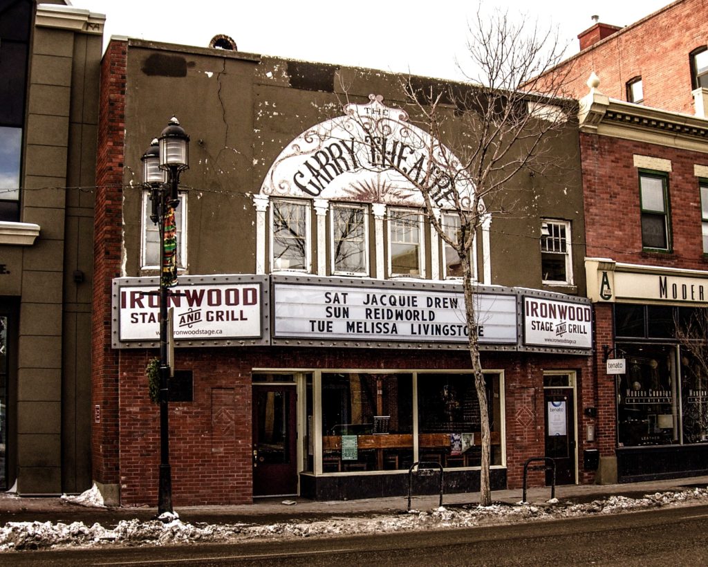
A marquee itself is a protruding structure over an entrance way to a theatre, performance venue or hotel. A marquee sign is generally an illuminated sign that is used to announce the name of the production or performers who are appearing for an upcoming show, as in this example (NOTE: this is a vintage sign in Calgary not constructed by Topmade). Their evolution to a trapezoidal shape from a basic rectangle also allowed them to more easily be noticed by drive-by traffic.
Marquees have a long history, going back to circus tents in the 1700s, and are thought to have gained popularity on buildings when automobile transportation became more widespread in the early 20th century. Where guests might arrive to attend a show by car, the marquee would give them protection from the elements.
Marquee signs are comprised of three main elements:
- The architectural structure. This is usually a roof-like apparatus, protruding from the building structure over the main entryway. If you’d like such a structure and the building does not currently have one, you’ll need to consult an architect about having one constructed.
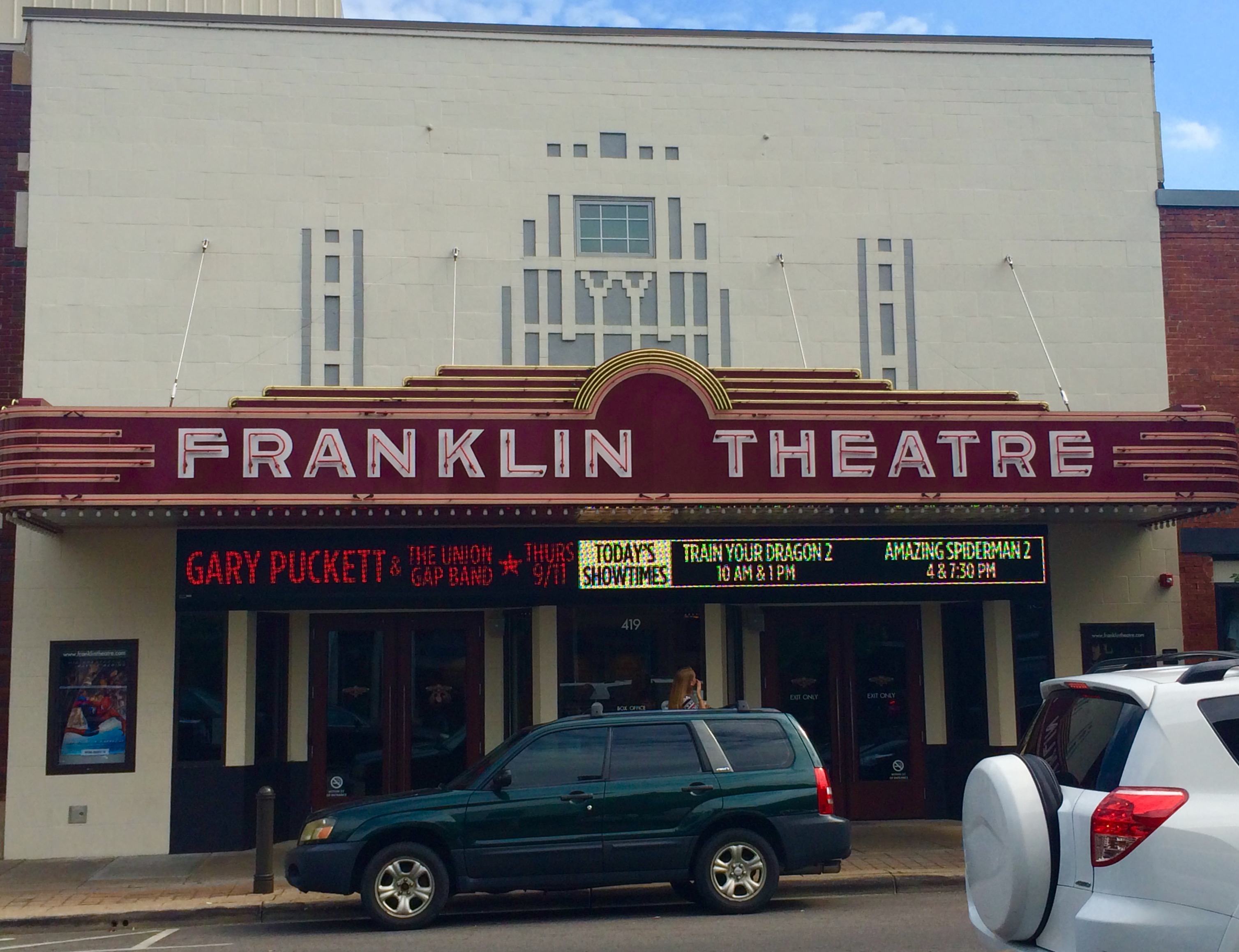
- The lit sign fascias. Today, lit sign fascias these can be fully electronic and full colour (see Franklin Theatre for an electronic example), or simply backlit boxes with letter board racks that can be changed by hand.
- The decorative trim lights – Exposed bulbs (known as Edison bulbs, which can actually be LED lights that look like traditional Edison bulbs) are popular, but there are many ways to trim around a marquee.
With this in mind, while you are imagining your stunning marquee sign, keep in mind a few of our recommendations:
1. Allow for the largest letter height you can – readability of the marquee is critical. If you can’t fit everything, you can always make room for a website address for details.
2. Realize that you will have to constantly change letters, clean and maintain your sign. A marquee is a centerpiece of any street, so it can certainly make a lasting impression about the entire neighbourhood. It is a responsibility that should be taken seriously. If you simply don’t have the staff to handle it, you should definitely consider a maintenance agreement from Topmade.
 3. One final thought about marquee signs. Remember that if you indeed create a beautiful marquee, hundreds or thousands of people may take photos of themselves in front of your sign or building over the years. These photos could be shared in social media and create wonderful free publicity, and beautiful memories.
We hope you will design your marquee sign with maximum “wow” effect, since it will undoubtedly be the visual centrepiece of your business, and quite possibly a centrepiece of your retail neighbourhood. Be sure to visit or call us here at Topmade for design recommendations.
The end of 2016 is fast approaching and it won’t be long before your news feeds are bombarded with prediction articles for the hot trends of 2017. In fact, we’ve already noticed quite a few on the topic of interior design. And while an accounting firm can rely on traditional design elements for their building, it’s important to pay attention to the latest styles if you’re a retail business.
A well-designed store communicates to your customers that you are an expert. So, if you’re starting a retail business, or revamping your current shop’s look, here are three design trends to keep in mind:
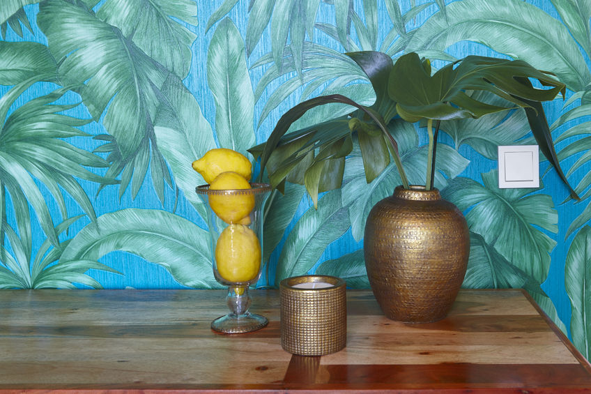
- Colour: Depending on what interior design blog you read, colour choices for 2017 seem to differ. Most agree that vibrant jewel tones will replace the pastels of last season. Green, in particular, will take a front seat. In design, the colour green is associated with the natural environment, healing, growth and success. It is a relaxing colour that indicates preparedness. Given the rising demand for natural textures in interior design, it’s a choice that makes sense.
How can this trend be incorporated into your signage or store graphics?
You could use it in your logo or as an accent colour in your store. However, you may want a less permanent option given the temporary nature of trends. For example, most LED backlit signs use white as their lighting colour. If you use green, it will automatically set you apart from your neighbours and create an interesting ambiance. If you want to change it later, you can have the bulbs replaced. Or, better yet, have a RGB colour changing LED module installed. With a simple click of a button, you can transform your sign’s lighting.
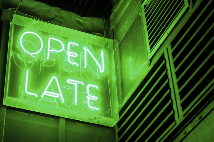
If you’re looking for an interior décor option, a neon sign that uses green would be a beautiful addition to any wall.
- Texture: Organic textures in interior design have always been popular, but in 2017 there will be a focus on unpolished and rough-edged pieces. To give objects a visual boost, natural materials, like marble and gold or wood and metal, will be combined in interesting ways.
 How can this trend be incorporated into your signage or store graphics?
Thanks to CNC engraving machines, beautiful signs and images can be carved with precision into natural materials like stone, metal, or wood. Treatments can be used to create a worn appearance on wood or stone or to mimic a beautiful patina on metal. For instance, we use sandblasting to form a textured grain on wooden engraved signs. By integrating details, like metal fastenings on your wooden sign, it can easily become a piece of art. Customers will know, with a single glance, that you take time to consider the details and are invested in your business.
- Imagery: Interior design experts predict, due to overuse, that the popularity of inspirational quote graphics will rapidly decline in 2017. These quotes were often created as vinyl graphics for store walls or integrated into a beautiful photograph as a sign or wallpaper. So, what will take its place? Continuing with the natural environment theme, interior designers suggest that patterns and shapes based on flowers, plants and stone will start appearing on the shelves in greater numbers.
How can this trend be incorporated into your signage or store graphics?
Interior designer Marie Flanagan suggests turning nature inspired art into beautiful wallpaper. At Topmade, our digital printer can print up to 51” wide on a variety materials. As a result, a watercolour landscape painting can be professionally scanned, enlarged, and printed as a vinyl wall covering. Vinyl is simple to install and remove, so you can switch up the art depending on the season or event.
Bonus Trend! As a response to growing environmental-awareness, opportunities for upcycling will increase. Upcycling is a process of repurposing old objects. If you have an opportunity to refurbish a vintage sign, it can be a great investment for your business – find out more on our article on retro sign styles.
Our team at Topmade are experts in the field and passionate about the latest technology and trends in the sign industry. If you’d like guidance on signage and graphics for your store, give us a call.
While good products and solid offerings can go a long way, a bad store layout can significantly limit your business’ success. For example, a shop that is nothing but rows of stuffed clothing racks can be a major turn-off. Sure, options are great, but not when a customer feels they’ll have to invest their whole day to find the cardigan section.
Then there’s the other extreme – the minimalist “open-concept” store. Have you ever struggled to find a sales counter and given up on a purchase? We know we have! Customers can miss key items or departments without the subtle guidance of appropriate signage. This translates into a loss in profits as well as a frustrated customer.
Fortunately, if you implement some basic design rules when creating your signage, you can positively impact your customer’s journey.
Retail signage is quite a large category that includes:
- Department, floor, or washroom signs
- Pricing or comparison charts
- Event posters or banners
- Sales and price tags
- Employee badges or nametags
- Wall décor, featuring photographs or quotes
- Pathway markers or floor transitions
Each of these sign types can be achieved visually in dramatically different ways. For instance, a sign indicating a sales counter can be a series of raised LED letters, a vinyl decal, a hanging sign or a movable floor stand. Figuring out which method will work best for you will depend on your business goals and what experience you want for your customer. If you’re a brand that’s selling a lifestyle along with a product, then make sure each aspect of your signage helps augment the mood.
When starting the design process for your retail signage, you should keep in mind to:
1. Identify how you want to organize your products.
For example, will it be by product type (menswear and accessories) or by brand (Marvel and DC)? Then you will want to display your products in a way that customers can easily find and distinguish between the categories. So, rather than filling your shelves completely, leave some breathing room between product groups. Or create imaginary space by changing the colour of the shelves or tags. Either way, have obvious labels so browsers don’t find themselves suddenly in the completely wrong department.
2. Establish which areas of your store are high performing and low performing.
Typically near the entrance is the ideal location. As you move towards the back of the store, it’s increasingly difficult to entice customers. By breaking up the monotony of shelving, or by creating an eye-catching display, signage can be used to generate the necessary curiosity.
3. Use signs and fixtures to guide your customer through the store.
Sometimes there is a specific journey that you want your customers to take. If you spend a significant amount of money creating a narrative store experience, it would be a shame for your customer to miss it because they took a wrong turn. Or imagine wandering Ikea without the helpful guides. You might find yourself walking in circles! Floor graphics, often created using a textured no-slip vinyl, is a straight-forward way to lead visitors. And it can be as obvious or as subtle as you like, depending on the aesthetics of your store.
4. Keep your store experience fresh by switching out your signs.
Over time, if a store stays the same, then regular customers can become bored with a shopping experience. On the other hand, it can be costly to change your floor plan or furniture constantly. For a much more reasonable price, you can invest in a few movable signs, to hang from the ceiling or place in stands, to use at certain points in the year.
5. Clearly show if a product is new or on sale, don’t just say it.
A good bargain is nothing to be ashamed of, and yet most retail sales racks are hidden and poorly labelled. If you want to move this product, a tiny red sticker on a price tag is not enough. Ensure the racks or shelves feature an enticing sales sign at a reasonable size. If a shy or busy customer isn’t sure an item is included in a sale, they might not bother to ask. And if you have a new product line, present it proudly. Novelty will keep customers returning to your shop, so introduce new offerings with adequate pomp and circumstance.
We’ve discussed aspects related to retail signage before during our blogs on vinyl signs and incorporating QR codes. But with such a rich topic, we’ve still barely scratched the surface! If you’re in need of signage consulting or manufacturing, give Topmade a call. We can help you get what you need and keep your signs looking at their best.