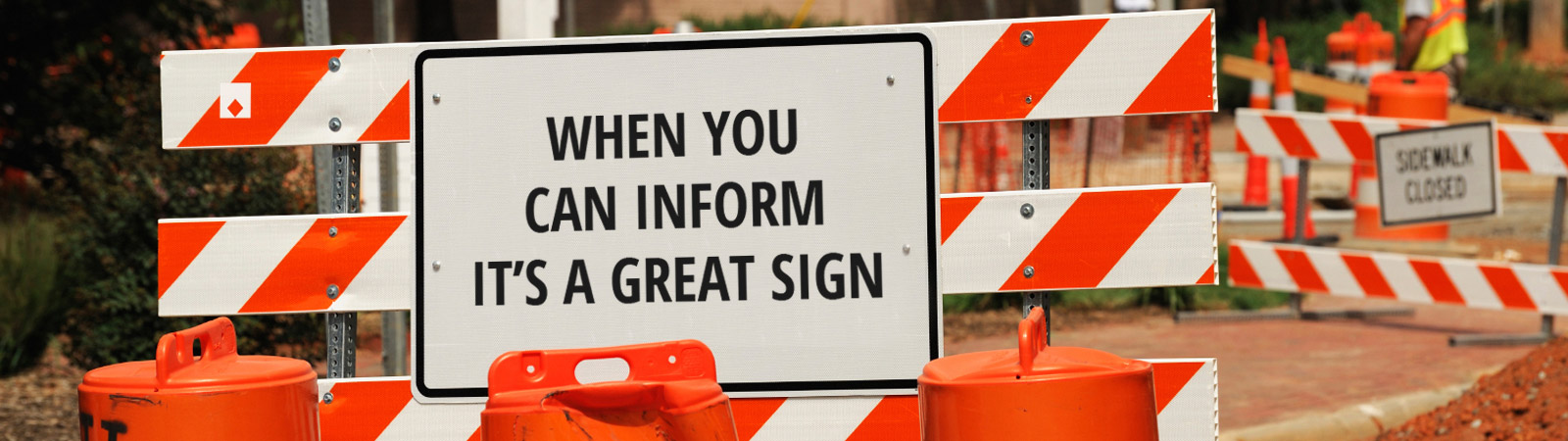
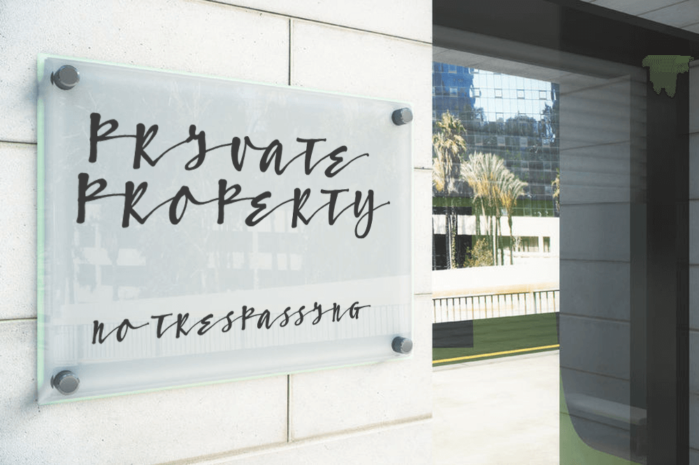
How’s your sign holding up? Driving around town we see lots of neglected signage, and since that’s the thing we do, we can’t help but wince sometimes.
Dirty Awnings
All outdoor signage is going to accumulate dust, road film, bird droppings, etc., and a dirty awning sends the loud and clear message that you don’t care about your image. Sometimes all it takes is a firm spray of water to freshen up your awning– particularly if you do it regularly– but if you’ve been lax you’ll need to get up there with a ladder, brush, and warm, mild soapy water to clear away the grime. It’s time well spent to make your business stand out; try cleaning your awning at least as often as you clean your windows. Don’t expect a rainstorm to take care of it for you; that’s likely just going to add streaks to the mess.
Vinyl Letters Peeling Off
Nothing makes your business looked abandoned quite so effectively as cracking, peeling vinyl letters or logos. There are two types of vinyl film used, namely Calendered (short term) and Cast (premium). They’re basically the same stuff, just different processes, cost, and handling properties. Bottom line is this: the less you spent on your vinyl, the sooner it will have to be serviced or replaced. Given enough time in the sun, cracking or peeling is unavoidable; all vinyl has a maximum outdoor life. Left uncorrected, it too sends a bad message about your image. Peeling vinyl screams it’s time for you to get your signage refreshed.
Burned Out Lighting
What do your channel letters spell now? Are your customers stopping for gas at the _hell station, or perhaps your Funeral Home has become a Fun_ Home? It’s not a problem restricted to channel letters either; back or front lighting can also fail, to humorous (or maybe tragic) effect. Don’t let lighting failures make your business look bad!
General Fading
No matter what material your signage is made from, weather and sunlight takes its toll, and some materials and colour processes deteriorate faster than others. A good sign manufacturer is going to make sure you’re using the most durable materials from the outset. For instance, if sign elements are made of wood, that wood needs to be properly preserved; if paint is used, it needs to be of the correct type to bond with the underlying material. There are so many other considerations, not the least of which are the weather conditions to which the sign is subjected.
Winter Time Changes
If your lit signage is on a timed switch, you’ll need to make adjustments for the seasonal variation of daylight periods, not to mention the the back-and-forth between Daylight Saving Time and Standard Time. If you’re open until 8 PM in December, but that timer still reflects a 9:45 sunset, it could cost you traffic when people see an unlit sign and assume you’re closed.
Sight Line Changes
Is your sign still as clearly visible as when it was installed? If trees, new construction or neighbouring signage is obscuring your message, it might be time for a refresh (or possibly some tree pruning).
A Footnote About Flags…
We don’t prune trees, nor do we sell flags… BUT if your institution or business displays a flag, show you really care and fly it respectfully and proudly! At minimum, that means taking care not to fly a flag that is badly faded, tattered or torn. We recently passed by one Canadian flag that had been flying so long it had faded to pink and white, and was so frayed that the second red bar was completely gone. It’s better not to raise a flag at all than to fly one in such condition.
If your signage is ailing in any way, Topmade can help. We want your business or institution signage to send the best possible message: that you care how the world sees you!
Sometimes clients miss critical pieces of information when ordering signs; so we thought we’d provide a simple signage checklist. Might as well tick these off, to avoid being ticked off later if your sign misses the mark, and you’re smacking yourself in the forehead (hopefully not on your brand new sign!). Here goes…and yes we’ll plan to add to this list as we go!
Spell Check your Sign. Make 100% sure that all of the sign is checked for correct, or even preferred spelling. This can also be a missing word, like a “to” or a “the”. Such attention to detail can make the difference between looking amateur or professional.
Be Precise about Colours. Not everyone knows what shade their logos exactly are. To avoid confusion, check and select your colour via Pantones or CMYK numbers online; this can be done through referring to a printed booklet or online colour charts.
Consider Visibility in Choosing the Size. It’s very important to know from how far away your sign will be viewed. Too many words, or too-small an image, and the sign loses effectiveness for passing traffic. Click here to refer to our guide on “How Large Should your Sign Be?”
Does it Have the Right Data on it? Many signs are missing critical data – like a website address, phone number or business hours. It might be as simple as adding a “24h” or “8-5 daily” to the main sign, or a website address. Remember, a sign is your sales representative when you cannot be.
Bring us Photos and Measurements of the Location. Don’t just say, “I want a sign about this big.” You could easily over or underestimate the location and environment in which it will be displayed. Take photos close to, and further away from the location, and put a ruler or measuring tape in the photos. That will help us immensely in creating the ideal size. For larger jobs, we will, of course, visit your location to measure it ourselves prior to getting final specifications.
Check the Mounting Options. You might be surprised to learn that you’ve planned to mount your sign on a concrete wall that won’t take typical hangers, or that it can’t be breached with mounting equipment that will keep your sign stable. Be sure to carefully check for mounting options, including electrical outlets. If you need hanging equipment attached, bolt mounts, or grommets, it can all be done before the sign leaves the shop. Safety is also always a concern; you don’t want to be one of those people whose heavy sign crashed from the string attached to a false ceiling!
Consider night visibility. You don’t need to work at night, but it’s pretty cheap to have your sign doing so for you. Consider if your inside or outside sign should be visible at night, and whether it needs to look its best in full brightness (day) or night. It can be difficult to try to find ways to light a sign after it’s been designed.
Durability. At Topmade, we can UV-protect, laminate, coat, trim, and choose substrates that will take a lot of abuse without showing wear. Think carefully about what all the most careless people you know might do to your sign (well, don’t dwell too long on that!)….and then use “Murphy’s Law” to keep us in the loop as to what your sign might be subjected to. Getting the right material will surely be cheaper than replacing the whole sign later.
Do you have more suggestions? Please get in touch, and we’d be happy to help you get the best signage for your business’ needs!
You want your sign to Attract, Direct and Inform your target audience. It is a message to the world; be sure it gets noticed. Who hasn’t been driving down the street, stopped at a store and made a purchase, merely because they noticed the sign?
Once you’ve decided what you want to say, there are a few things you should reflect on before you visit Topmade. Here are some considerations in designing a great commercial sign.
Strategy
Be aware of your competitors’ marketing strategy and try to make yours distinct. Your sign is often the first impression of your brand– whether luxury, budget conscious, high-tech or otherwise. If you allow your business to look like a carbon copy of another business, then you’re subtly telling people you’re a lesser version of the original.
Message
Tell the world who you are! Ever gone by a sign and wondered, “Geez, what do they do?” For certain businesses, there may be some mystery they want to evoke, but vagueness is a real hindrance for the vast majority of companies. The two primary elements are the business name and logo. Obviously, when you design your signage you should have these two elements solidified. But if for some reason your name and logo do not really convey what it is you do, consider a tagline or imagery that further clarifies the message. A sign is a true opportunity to bring in new traffic. Even if your business is a sophisticated consulting firm or highly specialized technical service, you never know who could be walking by, and whether they have friends or family members who might fit within your precise target market.
Colour
Choose your colours carefully. Your colour choice will help your commercial sign get noticed, read and remembered. Give some careful thought to what colours fit your business’ brand and what will be noticed from across the street. A poor colour choice can make it difficult to read your sign or even notice it in the first place, while compelling colour is integral to brand identity– think of Coca-Cola red & white, or McDonald’s golden arches. On the other hand, if you have a logo that just doesn’t read well, or a corporate colour scheme that won’t lend well to your sign, you might consider doing a natural treatment (e.g. wood or metallic) or converting your sign into black and white.
Another important consideration: trendy colours. Some business owners may feel compelled to convey their personality via signs that use current, edgy colour trends, but care should be taken to consider longevity when designing static signage. Today’s “colour of the year” could be tomorrow’s eyesore.
Contrast
Apart from colour, a sign’s contrast will usually determine its readability and is a huge factor in engaging the attention of passersby. Contrast refers to the difference between light and dark, and this can be dramatically affected by how the sign is lit and placed on its intended background.
Most signs will include either text or graphics in the foreground, with a continuous background colour. Contrast between these two elements is critical to the viewer’s retention of the content. Pairing similar colours will decrease a sign’s readability, but a weak colour contrast can be strengthened with outlines, drop shadows around the foreground elements, or lighting. The reflective properties of the chosen materials must also be considered.
Font Choice
As we’ve mentioned recently, a clear and simple statement can be rendered ineffective with a poor choice of font. Pick out a font type that is easy to read, and consider the distance from which passersby are likely to see the sign. Steer clear of font types that are difficult to see from a distance, and make sure the size of your font is large enough to read.
Graphics and Images
A key asset to a commercial sign is beautiful eye-catching graphics and images. Pairing graphics and/or images with your main message can instantly bring focus to the product or service you’re offering. Your image should also be a size that can be easily seen and identified from a distance, and not weave in so closely to the text that it confuses text with image.
Size
Simply put, the larger the letter, the easier it is to read. We almost always recommend using the biggest sign your landlord or municipality will allow. After all, it is a billboard, right at your location, for which you need not pay monthly fees!
The size of your sign is especially important if you’re creating roadside signage or signs that will be displayed at a significant distance. A good rule of thumb is ten feet per inch of letter height. Say you have lettering that is one inch high and clearly legible at a distance of ten feet; at a distance of 100 feet the lettering would have to be 10 inches high to achieve the same impact.
Placement
Just like font, type size and image size, you should think about where your sign is being placed. You may already be working with strict size specifications. If not, make sure your commercial sign is large enough to get noticed and to accommodate all your design elements (i.e. name, logo, headline, graphics, etc.).
Conclusion
In this technology-centred world, we’re often talking about advertising and marketing online and especially over mobile phones. But when it comes to really grabbing people’s attention with immediacy, sometimes a real, physically impressive, solid sign can be your best bet. It says, “we’re here in the flesh” and helps to build customer trust, so it’s worth getting right.
Extensive design experience is just one reason Topmade is Calgary’s leading full-service sign manufacturer. Give us a call today!
In our last blog, we talked about typography and how your font choice can impact your sign’s legibility, as well as its visual appeal. Today we’re going to explore an equally important design element – colour.
Artists can spend years exploring how to expertly manipulate the power of colour. But if a career in the fine arts isn’t part of your life plan, don’t worry. By reviewing a few key concepts of basic colour theory, you will be able to make more informed decisions about an integral aspect of your sign’s design. And, if you’re working with a graphic designer, having a good grasp on design vocabulary can work wonders to reduce the revision process.
The Power of Colour
When we appreciate great signs, we tend to focus on the clever wording or the neat imagery. In comparison, as long as the sign isn’t hurting our eyes, we might not actively pay much attention to the colour choices. However, that does not mean colour should be underestimated. Its true power rests in how it subconsciously makes us feel.
Due to cultural, historical, or personal associations, colours have multiple meanings and can elicit strong responses. For example, in Europe and North America, purple represents royalty and riches. But why is that? Until 1856, purple dye was very difficult and costly to make. Soon, purple fabric became a symbol of the wealthiest class. When Cadbury, a chocolate company located in the UK, uses purple as a packaging colour, they’re sending a clear message to their consumers: Cadbury chocolate is rich, high quality, and decadent.
At the same time, purple can mean something very different in other parts of the world. In Brazil, for instance, purple is worn with black when mourning. So if you’re planning to expand your business globally, it might be worthwhile to investigate the various meanings of your chosen colours thoroughly before using them.
In short, colours are imbued with meaning. They are also a useful tool when planning your design’s composition. A carefully chosen colour, like a bright yellow against a backdrop of greys, can balance an asymmetrical design or guide the viewers eyes along a predetermined path.
Basic Colour Terminology
Hue is the name of a colour.
Saturation is the intensity of a colour. A vivid colour has a high saturation, while a dull colour is desaturated.
Brightness is how light or dark a colour is.
In addition to portraying specific meanings, colours can also feel warm, neutral and cool. Warm colours, like red, appear to pop in a composition whereas cool colours, like blue, recede.
The Colour Wheel and Colour Harmonies
Choosing one colour might not seem intimidating, but how do you decide on an appealing palette of two or three? In general, it’s best to keep colour combinations simple. This means there should be a primary colour – think Home Depot’s orange or Snapchat’s yellow – followed by a few, less dominant, accent colours.
For these difficult decisions, we often rely on a colour wheel. Using the colour wheel, you can easily identify sets of colours that work well together. These successful colour relationships are referred to as “colour harmonies.”
Complementary: Two colours that are opposites on the colour wheel. These colours will have a strong contrast with each other and the result is dramatic.
Split Complementary: Like complementary but a little subtler. A primary colour is picked and the two supporting colours will be adjacent to the complementary colour of the primary.
Double Complementary/Rectangle: 4-colour combination that consists of two complementary pairs. Because this colour scheme features a lot of contrasts, set one colour as the primary, and use the secondary colours sparingly.
Analogous: Two or more colours that are beside each other on the colour wheel. The colours are similar; so, it creates a soothing and natural combination.
Triadic: Three colours that are spaced evenly around a colour wheel. This variety in colour leads to a vibrant colour combination. To tame the results, two of the colours should be used sparingly.
Monochromatic: Varieties of saturation and lightness of a single hue are used to create a colour scheme.
Colour harmonies are a great way to form a pleasing visual but don’t be afraid to break the “rules” when it suits the goal of the design. For example, if you’re hoping to disrupt the status quo with your sign, deliberately choosing discordant colours can shock and excite the viewer.
Designing your company’s sign is a great opportunity to really consider how colour can play a major role in your brand strategy. Once you’ve decided on a colour palette that supports your company’s message and tone, why not set down some brand guidelines? Ensuring colour consistency across the rest of your print materials will speed up future design projects and project a professional image.
We hope that this discussion in colour theory has been helpful and, if you’d like further guidance, Topmade offers expert signage consulting to help you decide what kind of sign is right for you.
Additional Sources:
Stone, T. L., Adams, S., & Morioka, N. (2006). Color design workbook: A real-world guide to using color in graphic design. Gloucester, Mass: Rockport Publishers.
Driving around town we see all kinds of signs, good and bad. Sometimes you’ll see some really questionable typographical choices clouding the whole point of a sign: to convey information. A little knowledge of basic typography can go a long way toward improving your signage.
Legibility is the first consideration in designing a sign or graphic, particularly if your goal is to direct customers or employees around your place of business. When time is of the essence– like finding an emergency exit, or maybe the washroom—elaborate, difficult-to-read fonts will be a negative experience for your visitors and can reflect poorly on your organization. Fancy type can be hard on the eyes, especially from a distance. Typographical choices should complement the purpose of the sign (informing, directing or attracting) and allow for being readable at a reasonable distance.
When not properly used, font, size and colour can confuse the message. Random changes in style can be confusing as well. It is important to find a consistent typeface to use throughout your business; this should be part of your brand identity. Select a font that effectively communicates your message, image and design needs. A nice clean type style choice will get your message across, not just more rapidly, but more memorably.
There are three main categories of typeface: Serif, Sans Serif, and Script. Serifs are short finishing strokes at the end of each stroke in a letterform. They are sometimes called “feet.” A large body of text is easier to read if it is in a serif font because these little ornamental effects help guide the eye from one letter to the next. This is why the publishers of books, magazines and newspapers use them almost exclusively. As for Sans Serif, obviously, sans means “without.” Sans Serif fonts are commonly used for headlines or titles. Their clean, simple appearance helps them stand out.
Script refers to typeface that mimics hand-lettered writing by pen, brush or pencil. It can add a touch of elegance in small doses, but can quickly destroy a design if overused. Script fonts are not intended for body copy or heavy usage; using them that way will detract from your message. Think of it as decoration; it’s meant to attract the eye, but too much decoration and you won’t know where to look! In other words, you may have a large box of jewelry, but you wouldn’t wear it all at once… would you?
When wanting to emphasize your message, sometimes the first impulse is to put it in all-capital letters. This is the print equivalent of shouting. While it might be effective for something short and urgent (think ATTENTION or DANGER), for longer messages it can actually make the message harder to take in. This is because of the way our brains process visual information; we don’t just read a stream of letters, we read words at a time– phrases, too– and these have “coastlines”. Putting a word in all-caps takes away its distinctive shape, making it just a rectangular letter stream. The longer your message is, the more important it is to utilize lowercase letters.
Kerningrefers to the space between letters. This usually requires some tweaking in titles, headlines and signage. Letters that have verticals next to each other (e.g. N, H) require more space between them to appear balanced, while neighbouring curves (e.g. O, C) require less space. The least space is needed between letters with lots of white space on their side edges (e.g. A, T, V). Getting the right kerning to achieve visual balance is really an art form, but even more important than visual balance is just being understood! If you’re not careful, “L I” can be seen as “U”, “c l” can be seen as “d” and so on, leading to endless embarrassing possibilities.
Tips:
If you’re using more than one font, make sure the types contrast. For instance, you could use a sans serif caption over a body of text in a serif font, but you’ll want to avoid mixing two slightly different serif fonts.
Use script fonts sparingly, and never ever use all-caps in a script font.
Stick to a unified font style as part of your brand.
Don’t use more than two to three fonts in a sign design.
Be clear, be concise and resist the urge to use a fancy but hard to read font. When in doubt, keep it simple and remember that less is more.
Try to be mindful of how your sign might appear at a glance. Squinting helps.
Sometimes typography seems to be an afterthought, but at Topmade we use it to help make your message clear and memorable. Give us a call to find out how we can improve on yours.
If you’re starting a new retail business this year, you may be wondering, “What kinds of signs do I really need to budget for?” We thought we’d supply a handy list of must-have signs for a typical retail environment.
1.Exterior fascia – This is the main sign with your business name or logo on it.Hopefully your name gives people an inkling of what you do, but if not, make sure it is somehow clear by using a few descriptive words or a tagline that also become part of the sign.You should have one or more of these signs to face each main direction of traffic flow.
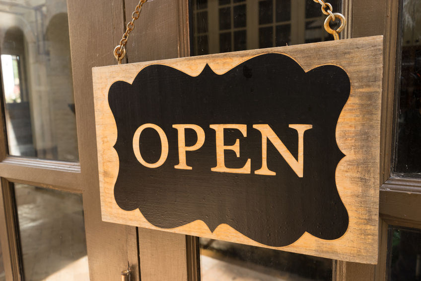
2.Open for Business–This may not be applicable if you’re locating inside a shopping mall, but in almost any other environment, a prominent “OPEN” (or “VACANCY” sign if you’re a hotel/motel) is extremely helpful and will attract business.Many stores use neon or lit LED signs to attract attention to OPEN signs as they are the most visible.
3. Business Hours – This should be posted visibly to the exterior doors.If this can be lit, even better, since when you are closed with lights off, it may be hard to read by a person from within a car. It’s also a great idea to have the sign data changeable, for holiday or seasonal hours, or if you decide you need to change your hours from time to time.
4. Product Category Signs – Use signs inside your store to tell people what is in the store – for example “bicycles”, “helmets”,“menswear” etc.These interior signs ensure people will get a faster understanding of what your offerings are, and they will be more likely to investigate multiple areas instead of simply coming for the one product that spurred them to visit.
5. Directional Signs – These include instructional signs such as “Place Orders” and “Pick Up Orders”, or “Customer Service” and “Washrooms” signs.Map out your business and ensure you have enough directional signs.
6.Safety Signs – Signs marking exits, fire escape/stairwells, push/pull doorways, fire extinguishers, “slippery when wet” and other areas should be properly placed. If you’re concerned about safety or access around display racks, we do encourage you to have your site inspected by City Fire Inspectors.
7.Parking Signs – Clearly mark where customers of your business are permitted to park, and for what duration. This will ensure your parking spaces are maximizing their benefit to your business.
8.Pylon Signs – If you can get a panel for your business within a multi-tenant pylon sign, or even get a dedicated pylon sign that attracts vehicle traffic, this will be a great benefit to your business, as it is very much like having your own billboard. It is also a good idea to refresh a pylon sign with a new design every few years, passers-by will often take notice of something new in their visual spectrum.Also, design of multi-tenant panels is tricky (since your business name and logo must compete with others in the sign) so do ask us for assistance in design if you do not already have a graphic designer on deck.
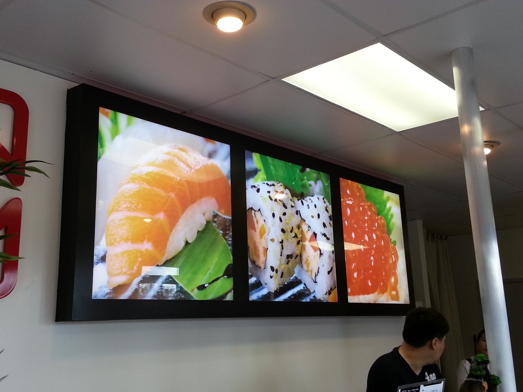
9. Decorative Signs –Beautiful lifestyle graphics are superior silent “salespeople” that help your merchandise create a compelling image and appeal to various categories of customers. If you’ve got some wonderful photography, or can access it through brands you might carry, we encourage you to create large, photographic imagery that creates a lifestyle to appeal to your customers. Screens to display product videos are also an excellent idea.
10. Philosophy and Policy Signs – Your mission, your history, your customer service guarantee, your environmental philosophy – these are all messages that will set you apart from the competition.Consider making signs containing these messages and placing them proudly for all to see.
11. Sandwich board signs – If walk-by traffic is a priority, consider some sandwich boards. These are free-standing A-frame signs that can be easily moved outside set up to direct traffic. If you use “chalk paint” you can also rub off and change the messaging using colourful chalk!
12. Directory Signs – If you’ve got a big, multi-departmental store, consider a floor map or layout near the entryways, allowing people to easily locate key product categories in your store. This will enhance the customer experience and once again give people a better understanding of the full range of merchandise you offer.
With these in mind, we at Topmade would be very happy to help you build a budget, and produce signage for your entire retail environment.Please contact us today to start planning.
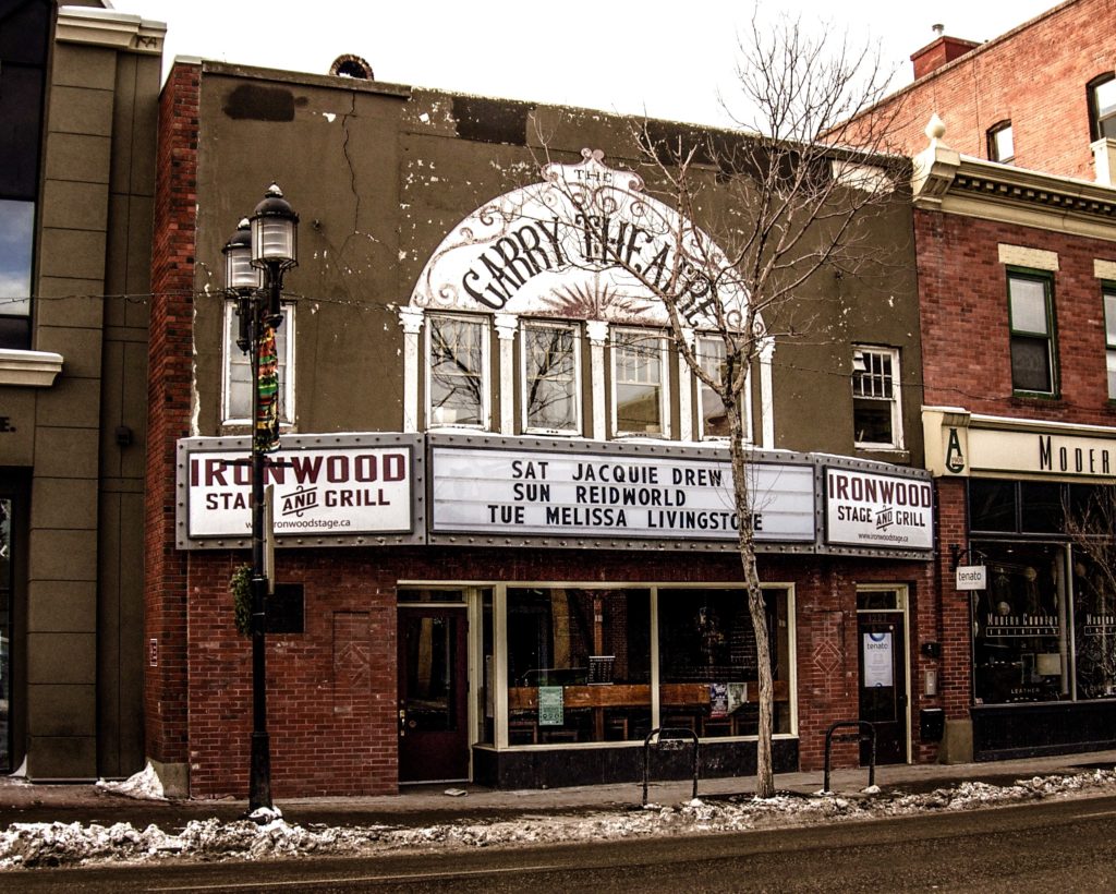
Ah, the vintage marquee sign.Marquees are truly the pinnacle of beauty in the sign world, as they become a centrepiece of beauty on any street, adding character, style and timeless attractiveness.
A marquee itself is a protruding structure over an entrance way to a theatre, performance venue or hotel.A marquee sign is generally an illuminated sign that is used toannounce the name of the production or performers who are appearing for an upcoming show, as in this example (NOTE: this is a vintage sign in Calgary not constructed by Topmade). Their evolution to a trapezoidal shape from a basic rectangle also allowed them to more easily be noticed by drive-by traffic.
Marquees have a long history, going back to circus tents in the 1700s, and are thought to have gained popularity on buildings when automobile transportation became more widespread in the early 20th century. Where guests might arrive to attend a show by car, the marquee would give them protection from the elements.
Marquee signs are comprised of three main elements:
The architectural structure. This is usually a roof-like apparatus, protruding from the building structure over the main entryway. If you’d like such a structure and the building does not currently have one, you’ll need to consult an architect about having one constructed.
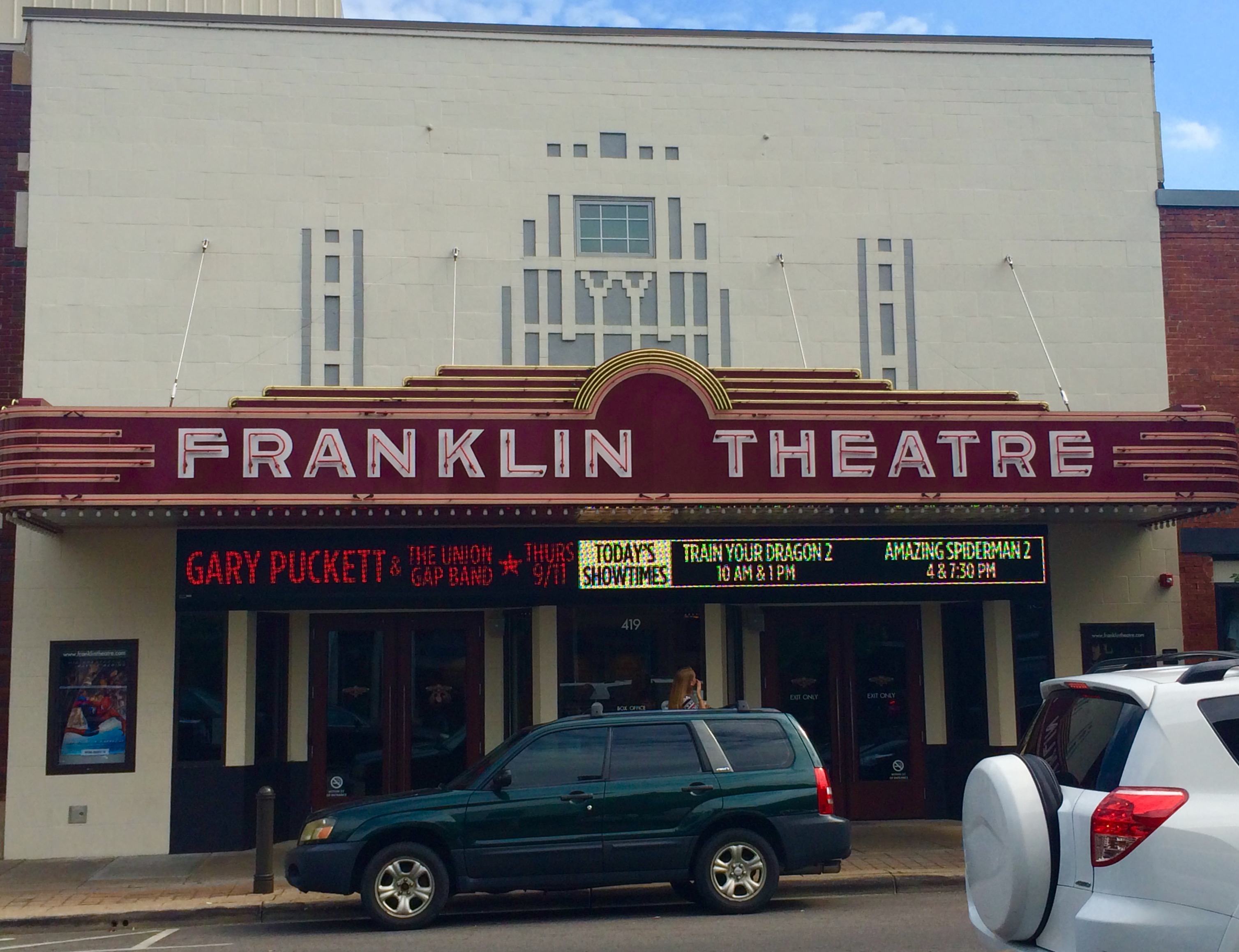
The lit sign fascias.Today, lit sign fascias these can be fully electronic and full colour (see Franklin Theatre for an electronic example), or simply backlit boxes with letter board racks that can be changed by hand.
The decorative trim lights –Exposed bulbs (known as Edison bulbs, which can actually be LED lights that look like traditional Edison bulbs) are popular, but there are many ways to trim around a marquee.
With this in mind, while you are imagining your stunning marquee sign, keep in mind a few of our recommendations:
1.Allow for the largest letter height you can– readability of the marquee is critical.If you can’t fit everything, you can always make room for a website address for details.
2.Realize that you will have to constantly change letters, clean and maintain your sign.A marquee is a centerpiece of any street, so it can certainly make a lasting impression about the entire neighbourhood.It is a responsibility that should be taken seriously.If you simply don’t have the staff to handle it, you should definitely consider a maintenance agreement from Topmade.
3. One final thought about marquee signs.Remember that if you indeed create a beautiful marquee, hundreds or thousands of people may take photos of themselves in front of your sign or building over the years.These photos could be shared in social media and create wonderful free publicity, and beautiful memories.
We hope you will design your marquee sign with maximum “wow” effect, since it will undoubtedly be the visual centrepiece of your business, and quite possibly a centrepiece of your retail neighbourhood. Be sure to visit or call us here at Topmade for design recommendations.
The end of 2016 is fast approaching and it won’t be long before your news feeds are bombarded with prediction articles for the hot trends of 2017. In fact, we’ve already noticed quite a few on the topic of interior design. And while an accounting firm can rely on traditional design elements for their building, it’s important to pay attention to the latest styles if you’re a retail business.
A well-designed store communicates to your customers that you are an expert. So, if you’re starting a retail business, or revamping your current shop’s look, here are three design trends to keep in mind:
How can this trend be incorporated into your signage or store graphics?
You could use it in your logo or as an accent colour in your store. However, you may want a less permanent option given the temporary nature of trends. For example, most LED backlit signs use white as their lighting colour. If you use green, it will automatically set you apart from your neighbours and create an interesting ambiance. If you want to change it later, you can have the bulbs replaced. Or, better yet, have a RGB colour changing LED module installed. With a simple click of a button, you can transform your sign’s lighting.
If you’re looking for an interior décor option, a neon sign that uses green would be a beautiful addition to any wall.
Texture: Organic textures in interior design have always been popular, but in 2017 there will be a focus on unpolished and rough-edged pieces. To give objects a visual boost, natural materials, like marble and gold or wood and metal, will be combined in interesting ways.
How can this trend be incorporated into your signage or store graphics?
Thanks to CNC engraving machines, beautiful signs and images can be carved with precision into natural materials like stone, metal, or wood. Treatments can be used to create a worn appearance on wood or stone or to mimic a beautiful patina on metal. For instance, we use sandblasting to form a textured grain on wooden engraved signs. By integrating details, like metal fastenings on your wooden sign, it can easily become a piece of art. Customers will know, with a single glance, that you take time to consider the details and are invested in your business.
How can this trend be incorporated into your signage or store graphics?
Interior designer Marie Flanagan suggests turning nature inspired art into beautiful wallpaper. At Topmade, our digital printer can print up to 51” wide on a variety materials. As a result, a watercolour landscape painting can be professionally scanned, enlarged, and printed as a vinyl wall covering. Vinyl is simple to install and remove, so you can switch up the art depending on the season or event.
Bonus Trend! As a response to growing environmental-awareness, opportunities for upcycling will increase. Upcycling is a process of repurposing old objects. If you have an opportunity to refurbish a vintage sign, it can be a great investment for your business – find out more on our article on retro sign styles.
Our team at Topmade are experts in the field and passionate about the latest technology and trends in the sign industry. If you’d like guidance on signage and graphics for your store, give us a call.
While good products and solid offerings can go a long way, a bad store layout can significantly limit your business’ success. For example, a shop that is nothing but rows of stuffed clothing racks can be a major turn-off. Sure, options are great, but not when a customer feels they’ll have to invest their whole day to find the cardigan section.
Then there’s the other extreme – the minimalist “open-concept” store. Have you ever struggled to find a sales counter and given up on a purchase? We know we have! Customers can miss key items or departments without the subtle guidance of appropriate signage. This translates into a loss in profits as well as a frustrated customer.
Fortunately, if you implement some basic design rules when creating your signage, you can positively impact your customer’s journey.
Retail signage is quite a large category that includes:
Department, floor, or washroom signs
Pricing or comparison charts
Event posters or banners
Sales and price tags
Employee badges or nametags
Wall décor, featuring photographs or quotes
Pathway markers or floor transitions
Each of these sign types can be achieved visually in dramatically different ways. For instance, a sign indicating a sales counter can be a series of raised LED letters, a vinyl decal, a hanging sign or a movable floor stand. Figuring out which method will work best for you will depend on your business goals and what experience you want for your customer. If you’re a brand that’s selling a lifestyle along with a product, then make sure each aspect of your signage helps augment the mood.
When starting the design process for your retail signage, you should keep in mind to:
1. Identify how you want to organize your products.
For example, will it be by product type (menswear and accessories) or by brand (Marvel and DC)? Then you will want to display your products in a way that customers can easily find and distinguish between the categories. So, rather than filling your shelves completely, leave some breathing room between product groups. Or create imaginary space by changing the colour of the shelves or tags. Either way, have obvious labels so browsers don’t find themselves suddenly in the completely wrong department.
2. Establish which areas of your store are high performing and low performing.
Typically near the entrance is the ideal location. As you move towards the back of the store, it’s increasingly difficult to entice customers. By breaking up the monotony of shelving, or by creating an eye-catching display, signage can be used to generate the necessary curiosity.
3. Use signs and fixtures to guide your customer through the store.
Sometimes there is a specific journey that you want your customers to take. If you spend a significant amount of money creating a narrative store experience, it would be a shame for your customer to miss it because they took a wrong turn. Or imagine wandering Ikea without the helpful guides. You might find yourself walking in circles! Floor graphics, often created using a textured no-slip vinyl, is a straight-forward way to lead visitors. And it can be as obvious or as subtle as you like, depending on the aesthetics of your store.
4. Keep your store experience fresh by switching out your signs.
Over time, if a store stays the same, then regular customers can become bored with a shopping experience. On the other hand, it can be costly to change your floor plan or furniture constantly. For a much more reasonable price, you can invest in a few movable signs, to hang from the ceiling or place in stands, to use at certain points in the year.
5. Clearly show if a product is new or on sale, don’t just say it.
A good bargain is nothing to be ashamed of, and yet most retail sales racks are hidden and poorly labelled. If you want to move this product, a tiny red sticker on a price tag is not enough. Ensure the racks or shelves feature an enticing sales sign at a reasonable size. If a shy or busy customer isn’t sure an item is included in a sale, they might not bother to ask. And if you have a new product line, present it proudly. Novelty will keep customers returning to your shop, so introduce new offerings with adequate pomp and circumstance.
We’ve discussed aspects related to retail signage before during our blogs on vinyl signs and incorporating QR codes. But with such a rich topic, we’ve still barely scratched the surface! If you’re in need of signage consulting or manufacturing, give Topmade a call. We can help you get what you need and keep your signs looking at their best.
When attending an event, there are many kinds of signs you should consider preparing to manage the crowds and flow of traffic. These can be useful for any event, from a family wedding to a corporate party. In fact, few event rental companies, who typically rent event tents or furniture, include or offer signs, so be sure you review our list below to cover off event needs.
Overall Branding Signs – Got a stage you’d like to light up? Name your event and put it on a large banner, board or display. (Even if it’s a family reunion). Just reminding people you are running a branded event gives it more credibility, because it has a name to which people can refer. It also creates elevates it as potentially a recurring event.
Reserved Seating – To avoid awkward moments of needing to move people out of assigned areas, make sure you use reserved seating signs, and specify the names to which that seating is assigned.
Nametags – Nametags are another great way to avoid awkward moments – ushers, key guests, and host/hostesses should wear tags invite people to ask them questions and help identify people who are “working” and versus other guests. (Note: distinctly coloured shirts are also a good idea for staff).
Washroom signs – You can never have too many washroom/directional signs. Be sure to place them in highly visible locations and mark separate Men’s and Ladies’ locations.
Payment area signs – “Please Pay Here” – If you’re accepting money, be sure people understand how and where to make payments. It also sets the tone that, for example, food or drinks are not free, so people realize this before they place orders for those items.
Payment Types accepted (Visa/MC/cash only) – This will help guests avoid frustration at having made their way through lineups, only to discover you cannot accept their method of payment.
Line-up Signs – Clearly, signs on stands and barriers will help manage the flow, avoiding blocking doors or access to key areas. By creating a floorplan of your event carefully, you can ensure you have enough, and anticipate how to move and adjust areas where traffic may become backed up.
Pricing Signs – Create pricing boards so people are not upset or surprised by the pricing you have set for various items at your event. Pricing boards inevitably improve sales, because few people will get in line to pay an unknown amount.
Guestbook Signs – If you have a guestbook, it can be easily forgotten without an obvious sign. What’s more, if you’re using it to collect email addresses, it could be a vital part of your follow-through/thank-you post-event strategy.
Coat Check – Coats, hats or boots can create a mess at tables and take up chair/seating space unnecessarily. If you can create a coat check area (and of course, post a price, if there is one, or mark it as “FREE” or “BY DONATION”) and mark it with bold signage, it will imply to people that they ought to check their coats.
Congratulations Signs with Names of Guests of Honour – Sometimes, not everyone attending will know the guests of honour, and this can create awkward moments. If you have an important sponsor or guest of honour, consider posting photographic signage of them so that people know who they are, and can acknowledge them as such.
Communications / Key Messages – What was the key purpose of your event? If it was to let the world know your philosophy of life, get people to appreciate what you stand for, or to make a marketing statement about your products, then signage, perhaps built into a creative display of some sort, is a great, silent way to communicate this while guest are mingling. Not everyone is a great networker, so giving them something to read while they circulate around the room is a wonderful way to get your message across.
Legal Signs – Is there any risk involved in your event? In this case, any legal signs should be included in a prominent area. If you are serving alcohol, providing a dance lesson, or even taking images that might be posted to a website, be sure to include some version of “This activity is….at your own risk” –
Signs to Acknowledge Sponsors – Finally, if you got any sponsors to fund your event, signage is an excellent way to acknowledge them. We’ve all been in the position where we’ve forgotten to thank someone in a speech…with signage, you can cover your bases and even take event photos so that sponsors are aware of the exposure they received. You could consider separate signs for each sponsor, or a main sponsor board. In the former case, this allows you to have a “bar sponsor” – in which case the sign is over the bar, for example.
Need to get these, or any other signs produced? Please contact us for your event; we can help you create a budget for your signs and get everything produced on time, made to order.
 Message
 Colour
 Contrast
 logo on it.
 5. Directional Signs – These include instructional signs such as “Place Orders” and “Pick Up Orders”, or “Customer Service” and “Washrooms” signs.
 8.
8. 9. Decorative Signs –
 12. Directory Signs – If you’ve got a big, multi-departmental store, consider a floor map or layout near the entryways, allowing people to easily locate key product categories in your store. This will enhance the customer experience and once again give people a better understanding of the full range of merchandise you offer.
 3. One final thought about marquee signs.
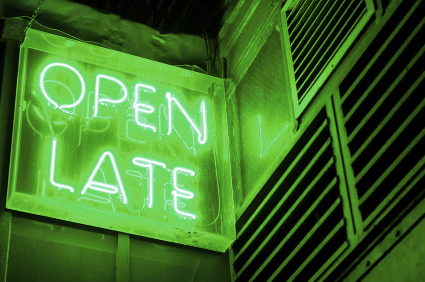
 How can this trend be incorporated into your signage or store graphics?
 Do you have the right signage for your event?