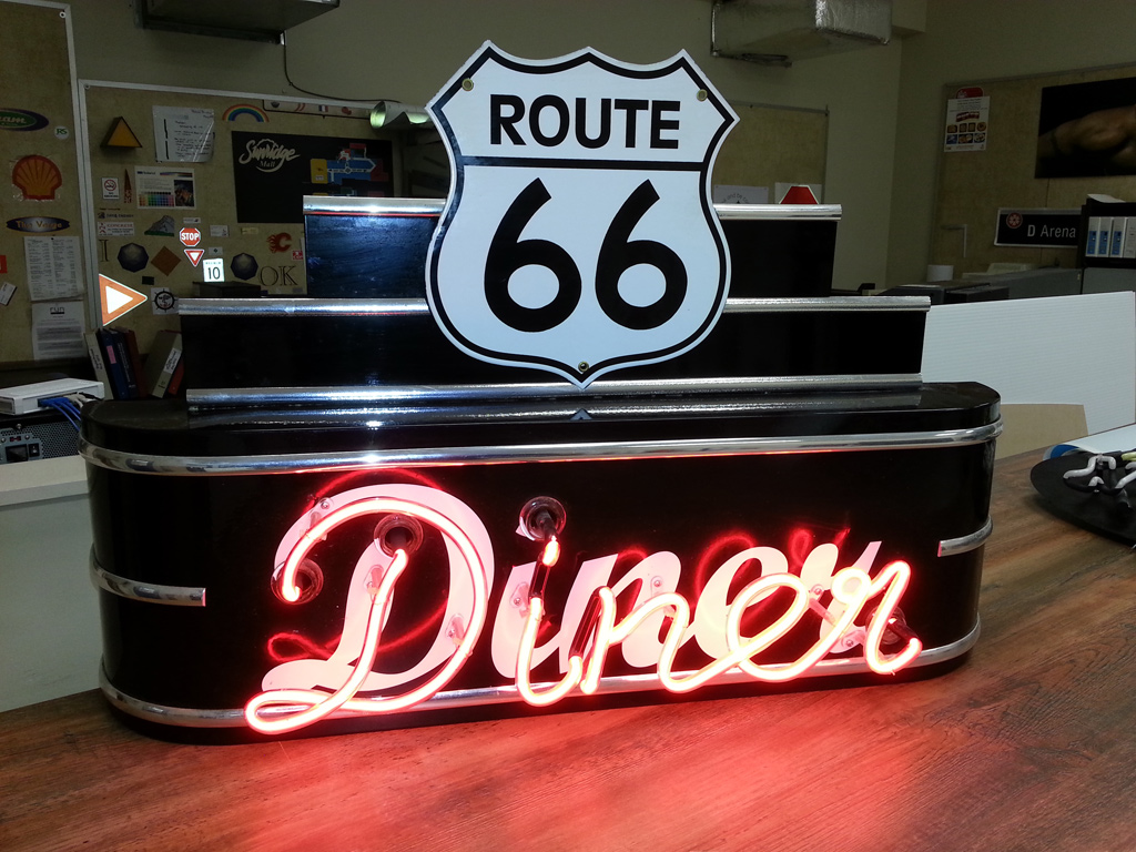
If you frequent the mall, you’ve probably noticed that styles of bygone eras are constantly making a comeback. But this trend isn’t limited to fashion. We’re experiencing a similar shift in our business, thanks to increasing requests for retro signs with vintage-inspired logos. The classic fonts, the neon and the fun and old-fashioned graphics – it’s easy to see why it’s become a popular design choice!
Retro is defined by the Merriam-Webster dictionary as “looking like or relating to styles or fashions from the past.”
Retro graphics are especially important in businesses looking to create an atmosphere, such as retail and hospitality. Because of its broad definition, retro offers immense versatility as a design style. For example, if you want your brand to appear glamorous and high energy, a sign based on popular “roaring twenties” imagery is a great choice. If you desire a more “mom-and-pop shop” feel for your business, a 1950s style might be more ideal. In general, while modern design is “cutting edge” it can also be considered “cold.” In comparison, retro design often evokes a warm feeling.
So, you’re ready to go retro. But with so many style choices, where do you start? Here are three popular options:
Lighting
We’ve gushed about beautiful neon signs before. Aside from neon tubes, you can also incorporate exposed bulbs into your design for an interesting lighting effect. And for a really retro look, use both styles at once! An iconic example of this is the “Welcome to Las Vegas” sign. As one of Calgary’s original neon sign makers, at Topmade we can build you something from scratch, and refurbish your old burnt-out bulbs.
Retro Letter and Graphic Styles
Find your ultimate retro fonts online and combine them with some old-fashioned art or imagery. For instance, Creative Bloq has a helpful post of 40 free retro fonts you can download and use. Another interesting approach is to weave in actual 3D elements of, say a classic car or motorcycle, or some other piece of the past – light it up to become part of your sign, and you’ll have a real eye catcher.
Refurbishing Classic Signs
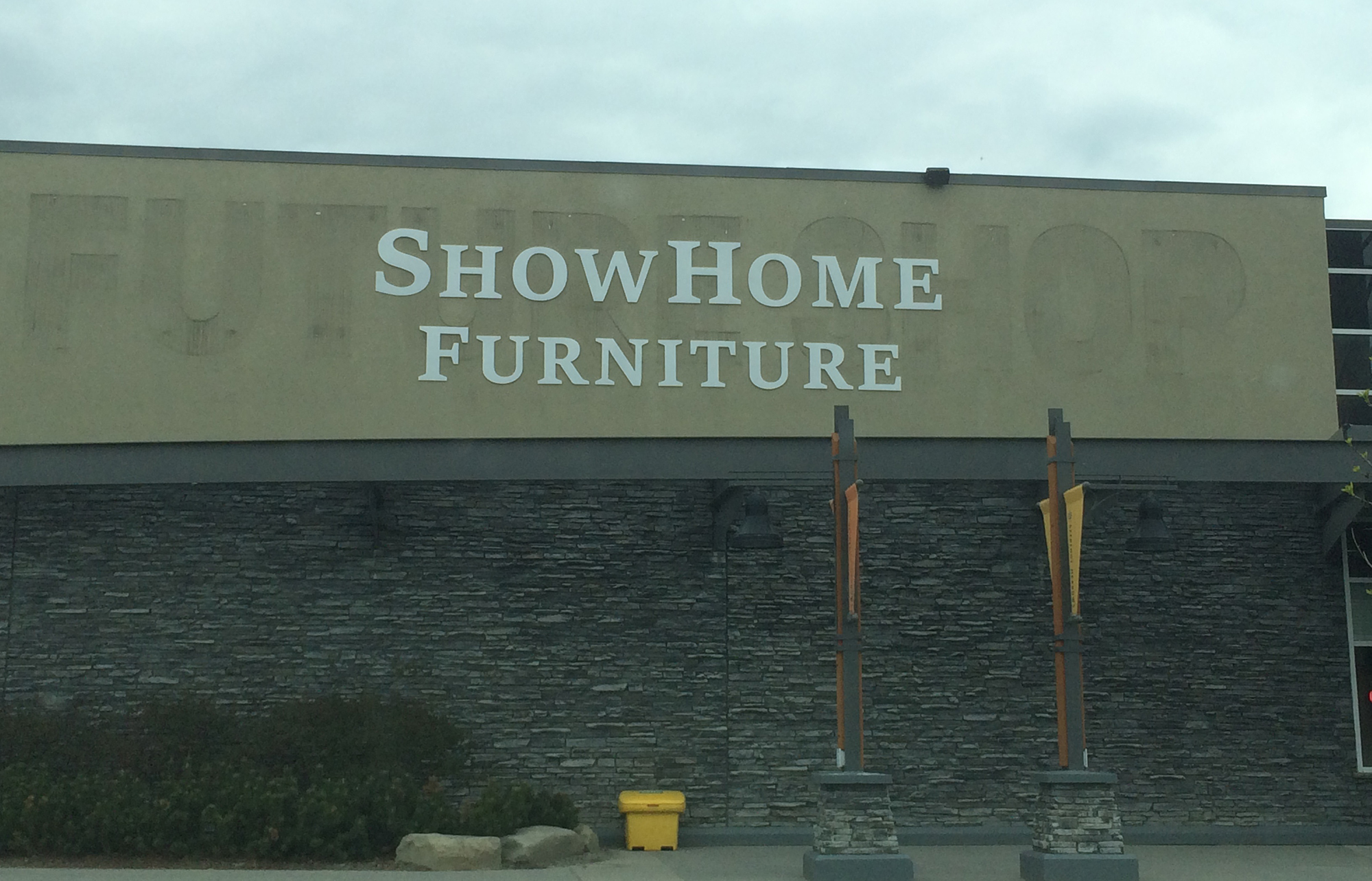
Did you buy a classic building with an existing vintage sign? Consider restoring it to show off the building’s history, like the Biscuit Building or the King Eddy. This is a way of saying you legitimately respect the history of the area, because you’re adding into it instead of writing overtop of it.
If you’d like to make your old sign look like new again, or your new sign look old, give Topmade a call. We’ve been in the sign manufacturing business since 1979. With our team of experts, we can help you brainstorm a retro sign design or refurbish your classic sign.
Signs, as much as we love ‘em, can have a limited amount of space to deliver your message. And if you try to cram it all in, you risk creating an unattractive and illegible sign. So how can you communicate important information, if you can’t increase your sign’s dimensions?
QR (Quick Response) Codes and Text Message Campaigns.
While you might not be familiar with the terms, we’re certain you’ve seen both before. Have you ever read a sign that asked you to text a specific word to a 5-digit number? For example, “text DRESSPLZ to 12345 to receive a 15% off promo code!” That’s a text message marketing campaign.
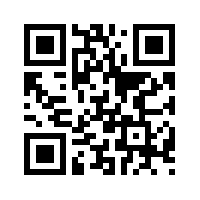
QR codes are like barcodes, but they’re more accessible and can store more information. Its basic form is a series of black and white boxes, like the example above, but they can also incorporate different colors and company logos. To access the QR code’s information, all you need is: a smartphone with a camera and the ability to download a free QR code reader app.
If you’d like to learn about the history of QR codes, visit qrcode.com.
Text message and QR code campaigns can include:
Discount offers
Links to surveys, contest entry forms, websites or social media
Product updates
General and contact information
Google map directions
Event reminders and tickets
Loyalty program information
Application downloads
Streaming video or music
You can use QR codes and text message on:
Signs and advertisements
Business cards and brochures
Product packaging and receipts
Bus shelters and benches
Clothing
TV broadcasts
Radio ads (for text message campaigns)
Vehicle wraps
Websites
In short, they’re an easy way for businesses, non-profits and organizations to distribute information quickly and conveniently via your smartphone. Because the purpose behind text message campaigns and QR codes is very similar, it’s not unusual to see both methods used on the same sign.
Why are QR codes and text message campaign such a helpful marketing tool?
You know it’s messaging the customer wants. Mobile ads appear whether someone desires it or not. If your mobile ads are seen as intrusive, then potential customers might form a negative impression of your company. On the other hand, they need to actively opt in with QR codes and text campaigns. So it’s natural to assume that, if they signed up, it’s because they’re already interested in what you have to offer.
A survey by SAP, a multinational software corporation, found that 76% of respondents are “more likely to read a message sooner if it’s an SMS/text message than if it’s an email.”
You can gather important information on your audience. There are plenty of tracking software options you can use with your QR code or text message campaigns. These applications keep an updated subscriber database and can report of statistics like number of coupon downloads and homepage visits. Using your POS system, you can even find out which customers used your coupons. This is helpful if you’d like to create targeted campaigns for frequent customers or unconverted leads.
You can send messages on a schedule or by proximity. Is your clothing shop throwing a lunchtime sale? Let customers, who have subscribed to your campaign, know in advance with a planned text. Or if a customer is browsing in your store, seal the deal by sending a promo code over Wi-Fi.
You can use a print ad to create an engaging multimedia experience. We’ve talked a lot about sending texts during your campaign, but don’t feel limited to characters and emojis. For instance, when someone scans your QR Code, maybe it sends them to a website, shows them a video or plays them a song.
Now, let’s get specific. Here’s an example of where a QR code, or a text message campaign, would be a great addition to a sign:
Earlier this month, we listed all the great reasons why you shouldn’t underestimate the impact of real estate yard signs. In the past, some real estate signs would have outdoor brochure boxes. While the printouts were protected from the elements, it was not the most convenient system. You’d have to budget for printing and re-stock it as needed. And what if you have too many signs in too many locations to monitor closely?
Modern real estate signs use QR codes or text message campaigns as a method to send MLS listings, contact details, and open house information to interested folks. Sending a short code, or scanning an image, is much easier than typing a frustratingly long url or trying to find specific information from a homepage.
As with any marketing tool, there are few things to consider before jumping in and using a QR code or text message campaign:
Keep messages brief and on topic. Even if someone subscribes to receive your texts, you should respect their privacy and their time. Keep messages to a minimum and make sure they’re valuable to your audience.
Know your audience. While it’s not a new technology, less tech-savvy individuals may be hesitant to participate in QR codes and text message campaigns. Your target audience will determine if a QR code or text message campaign is right for your business.
Make sure your website is responsive. If the goal of your sign is to drive traffic to your website, then any links you send should be easy to navigate on mobile.
QR codes and text message campaigns are just a couple of the ways that signs are evolving in response to trends in communication. At Topmade, we’ve been in the signage consulting and manufacturing business since 1979. If you’d like guidance on what design choices would work best for your business, give us a call.
In a previous blog post we discussed the lasting benefits of temporary construction signs. These signs are generally large format and used for substantial commercial and residential developments – like business parks and luxury condos. But what about real estate signs for single homes, modest apartment complexes and small businesses?
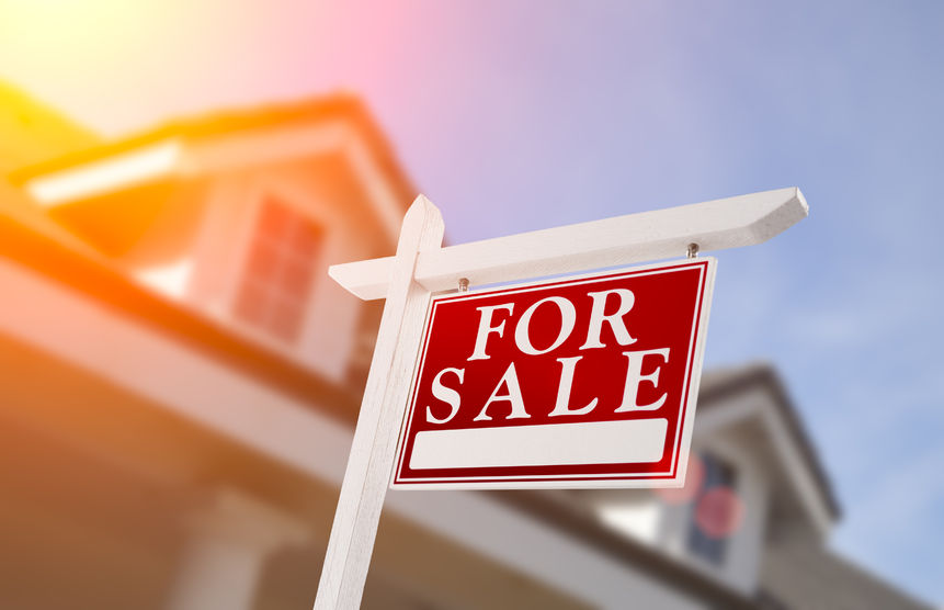
Even in today’s world of online listings and GPS delivered directions, a lawn sign is a significant part of lead generation. In fact, a 2012 survey by the National Association of Realtors® found that 53% of respondents considered yard signs as a resource when searching for a home. In comparison, only 27% stated that print ads played a part in their home buying process.
Why does this traditional method of advertisement continue to work so well? While online real estate listings are convenient, you can’t get the true feel of a neighbourhood by looking at a few pictures of a property. Understandably, many potential home buyers continue to drive around promising areas, in hopes of spotting a “for sale” or “for rent” sign. In addition, a sign can capture the curiosity of people who aren’t actively looking.
To avoid losing out on passing opportunities, you want to make sure your sign is well positioned and eye catching. So, what are the characteristics of an effective real estate sign?
Depending on whether you’re a real estate agent working for a well-known company, an independent realtor looking to build your personal brand, or a home owner determined to sell on your own terms, your design goals may differ.
If you’re an agent, make sure your name stands out. Even if you work for a popular franchise, adding a bit of your personality to your sign helps homeowners decide if you’re right for them. For instance, a professional headshot, or a short, catchy slogan, can be a great touch. You can also differentiate your name by size, font choice or colour, for a subtler approach. Bottom-line, when your name is boldly associated with multiple “SOLD” signs, it sends a strong message about your capabilities.
Set expectations with your sign’s design. If you specialize in luxury homes, your signs should also exude timelessness and sophistication. For instance, by featuring a logo that uses a beautiful script font and muted colours or by investing in quality materials for your signs, like an attractive wooden sign post. Whereas, if you are selling trendy condos downtown, bright, poppy colours and more modern fonts are a better bet.
Use multiple sign types to inform and direct traffic.
Arrow-shaped directional signs along a main road can be very helpful, if your property has an open house but it’s in an isolated location.
Brightly coloured feather flags can easily attract attention on the road, due to their size and how they move in the wind.
Indoor signs at an open house are useful as well. Use them to put visitors at ease by encouraging them to browse and ask questions.
Pick the right location, or sign type, for the job. As you can see in the above example, unless someone looks over the fence, the “for rent” sign is completely hidden. If fencing, bushes or parked traffic will obstruct a lower sign, it is better to invest in a sign post of sufficient height or a tall banner. Yard signs are also more effective near the street, rather than by the house.
When you don’t have a lot of sign space, rely on colours and shapes. You need to make sure your yard signs are readable for people driving by. Therefore, it’s best to keep content simple and at a sufficient font size. This includes: your name, phone number, website address, company logo, and a brief description, such as “for sale”. Alternating background colours, or using horizontal lines, can distinctly separate pieces of information to allow for quick reading.
Check your signs regularly for updates and maintenance. Use sign riders – small signs that are added on top of your yard sign – to advertise open houses or post status updates. For example, if there’s a price reduction, a brightly coloured sign rider is a great way to direct attention to the deal. It is also a good idea to regularly check on your signs, to make sure they haven’t been vandalized or damaged by the weather.
As always, check local regulations before buying and installing any sign. City bylaws and Home Owner Associations can determine how many signs you can use, where you can use them, what content they can include, and what size they need to be.
And if you need any help during the process, give us here at Topmade a call. We offer expert signage consulting – all the way from design to installation.
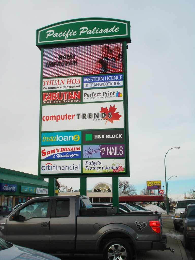
In a busy business park, it’s not uncommon for your store to be obstructed from the view of nearby traffic. For instance, there could be a large parking lot, or other businesses, located between your storefront and the road. If that’s the case, you can’t just rely on a sign above the door or else you’ll miss out on potential customers. This includes people who live nearby, who can become regulars, and impulse shoppers passing by. So what can you do to let people know about your business?
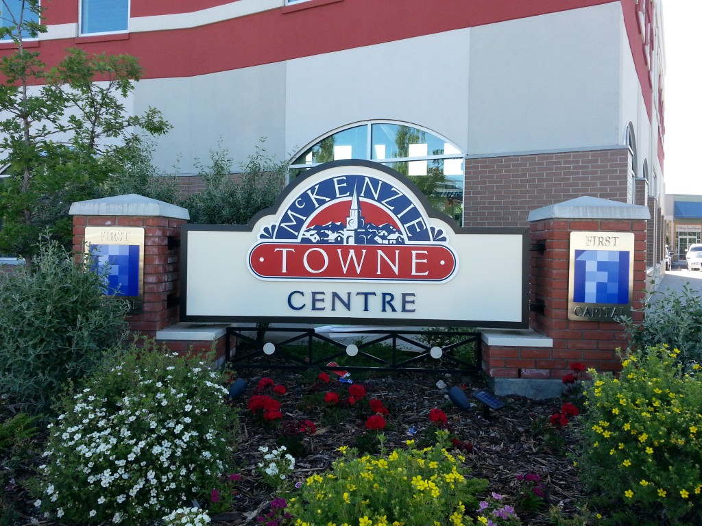
That’s where pylon and monument signs come in. As their name suggests, these freestanding outdoor signs are built to last, thanks to a strong base and the use of quality materials.
When deciding on a monument or pylon sign, be sure to consider:
The perfect size. For example, a pylon or monument sign should be taller than any nearby obstructions, like trees or parked cars. And, of course, check with the City on any applicable size restrictions.
The right position. Before purchase and installation of your sign, be aware of your property lines. It would be a shame to put in all that work, only to get in trouble once you find out it’s not your land!
For some beautiful and historic examples of pylon and neon signs, watch this video by Travel Thru History on the Neon Museum and the rescued vintage signs from the Vegas Strip. According to the Neon Museum, the Stardust roadside pylon sign was considered the tallest sign in the world for a decade after its creation. Talk about show-stopping!
Pylon signs are like a bold flag in the distance, letting people know where you are.
Pylon signs are also known as roadside, highway or pole signs. They are taller than monument signs and are often placed near the road with the goal of attracting visitors at a distance. Because they only have a moment to catch interest, pylon sign design needs to account for the time required for drivers to detect the sign, read it, and react accordingly. Bottom line, pylon signs should display only basic information for quick comprehension. Usually a business name or well-known logo and, maybe, a tag line.
But while pylon signs can be simple content-wise, they can also incorporate elaborate custom shapes, double-sided visuals, illumination and updatable digital boards.
Monument signs are like an attractive welcome mat, assuring customers they’ve reached the right place.
Monument signs are commonly shorter than pylon signs – about eye-level with a wide base. They are aimed at slower moving, approaching traffic to act as a directional marker. As an example, if you look at large campuses, which can be confusing to navigate, monument signs help visitors identify approaching buildings.
Based on its design, monument signs also give you a clue as to what to expect from a business. If it’s made of aluminum with hard edges, you might guess that the company is related to technology or offers state-of-the-art services. An engraved stone or wood monument sign, surrounded by beautiful landscaping, signals a more relaxed or calm space. A friendly suburb, perhaps, or a golf course.
Pylon and monument signs can also work together to attract visitors to your business.
Unique when compared to many other signs, pylon and monument signs might contain information for multiple businesses. In this case, the pylon or monument sign will complement the aesthetic of the overall shopping centre, rather than your business specifically. Under these circumstances, there are a few additional design elements you must consider, in order to stand out from your neighbours with such limited space.
Use negative space. Due to a number of logos competing for dominance in a relatively smaller area, negative space becomes increasingly important. You may be tempted to blow up your logo as much as possible, but, trust us, leaving some breathing room will go a long way. It will act as a nice frame around your logo and it will be more legible at a distance.
Switch up the background colour. If all the other businesses on the pylon sign are submitting their logos on white backgrounds, why not have yours on a solid colour background? It will really pop in comparison. However, make sure that your logo is still easy to read and that the colour matches your branding.
Take advantage of positioning (if you can).As we discussed in our article on designing menu boards, our eyes follow a particular pattern when reading different types of signs. The decision may be out of your hands, but the ideal spot on a pylon sign would be the top-left.
Bigger is better. Again, you may not have much flexibility here. But, if you can secure a larger spot on the sign, you will have a better chance of gaining attention. Or, if an extra spot opens up, see if you can claim it too. You can use it to bolster your logo with a coordinating call to action sign.
It’s summer in Calgary which means that the downtown streets are alive with activity – including new construction projects! And whether it’s a small store or a multi-story luxury condo, these construction projects take time to complete. If you’re building a new business, it might be tempting to hide your jobsite from curious eyes with plain barriers. However, investing in branded temporary construction signs creates exciting opportunities for your business to connect, in advance, with your future customers.
Construction Signs include:
Vinyl Fence Banners
Warning/Caution Signs
Pylons/Monument Signs
Construction Hoarding
Window Graphics
Benefits of Branded Construction Signs
It starts a buzz. You shouldn’t have to wait for opening day to advertise your business. Build up anticipation with an informative sign or teaser graphic! In addition, by using your brand colors and imagery cohesively, you set the tone for your business. Disney, for instance, doesn’t use “sorry, we’re undergoing maintenance” when an area is shut-down. Instead, it’s “pardon the pixie dust…the floor is temporarily closed while we work on the Magic.” Small touches like these all add up to create an immersive customer experience.
It keeps things hidden. If you’re an upscale retail business, you might not want future customers seeing your store messy and under construction – even for a short time! Strategically placed signage allows you to keep things under wraps until they’re ready to be revealed. On the other hand, you can also use your signs to cleverly frame certain views or to create display cases for merchandise.
It acts as a safety barrier. For construction hoarding that encircles an entire jobsite, signs can function as a way to keep the public out and to protect them from debris. Smaller construction signs can serve as a method to communicate important site and safety procedures.
It dissuades vandalism. Solid color walls of plywood are as inviting as a blank canvas and might encourage people to put up posters or create their own art. While collaborating with local artists can be great for your business, you want to make sure you have a say in what is posted on your hoarding. In contrast, planning in advance to create beautiful and interesting construction signage ensures you retain control of your brand messaging.
It establishes authority. If your construction project features the work of a well-known or respected architectural firm, for example, using their name on your hoarding can generate positive publicity.
To optimize the effectiveness of your construction signs, be sure to:
Attract. If your project is a real-estate development, 3D renderings of the exterior and interior of the building will go a long way. If you’re setting up a shop, use your sign to highlight some of your anticipated best-sellers. And because construction signs are temporary, you can really get creative with your ideas. For instance, check out these examples of hoardings on Pinterest. A number of them use colorful illustrations and optical illusions to draw the eye.
Direct. List your social media profiles and contact information, so viewers can stay up-to-date and share news about your business or products. You can also make your signs interactive, or contract a local artist, to create a memorable viewing experience. For example, Yogen Früz used removable paper cups on their construction signage as a way to promote sales and as a countdown for their store opening.
Turn a temporary eyesore into a landmark with great construction signs. If you need any professional insight into what type of construction sign is best for your business, give us here at Topmade a call. We offer expert signage consulting to guide you through the entire process – from design to implementation.
Trade shows are a perfect time to meet potential clients face-to-face, generate interest in your product or service, and see what the competition is up to. However, whether you’re attending or presenting, a trade show floor can also be an intimidating space. For instance, if you’re a business owner, chances are your storefront isn’t surrounded on all sides by your direct competitors. At a trade show, you’re often not so lucky. So, if you’re a home renovation company attending a Home & Garden Expo, how can your signage or displays stand out from the visual noise and attract attention to your booth?
Read the fine print. Every trade show or convention is slightly different. They may vary by the resources available to use, the times allotted for set-up and the booth size options. So before preparing your trade show display, read all the information provided carefully – especially measurements. Just like Goldilocks, you want the size of your displays to be just right. If your sign is too big, for example, you won’t be able to hang it properly. And if it’s too small, no one will notice it.
Think modularly. If you go to many trade shows you might want to plan your display a little more strategically. By treating your visual elements as modular pieces that can work together in multiple ways, you can successfully size up and size down your displays to fit small and large spaces effectively.
Build the hype. First off, let people know you’re going. You can put an announcement online and advertise in-store with eye-catching signs and flyers. Add a map of the trade show floor highlighting your location so customers and clients know where to find you. To create some extra publicity during the actual event, you can hand out branded freebies or hold a contest. Fear not, the prizes don’t have to be as extravagant as a vacation getaway. People just love free stuff. At Topmade, for example, we have created custom gifts like vinyl decals or engraved plaques.
Large signs to attract attention from far away. You want to dazzle these folks with interesting imagery and very basic information. This includes your brand name, a tag line that clearly explains what you do, and a method for contacting you. These signs should be hung higher, so they are visible over the crowd.
Medium-sized signs for people walking by. Roll-up banners are perfect for this role as they are at eye-level. In addition, the vertical format allows for information to be presented in an easily digestible list format. You can go into more detail about what your business or product can do on these signs, but you should still keep it to short sentences. These signs act to facilitate the moment where your knowledgeable staff can step in to answer any questions.
Smaller signs for visitors at your booth as well as take-home material that is neatly displayed. By entering your booth, a trade show attendee has demonstrated that they want to know more. Therefore, you can give a lot more information on these signs without fear of scaring them off.
Read the room. If you are at a conference that caters to industry experts, then focusing on the neat technical features of your product might be helpful. But if your trade show is B2C, or even B2B if there are many different types of businesses represented, you should avoid technical jargon. Instead, illustrate how your product or service will improve the lives of your potential customers. Customer testimonials are also helpful to display on your signage. They establish trust and create a personal narrative around your product or service.
Be Social. Of course your booth staff should be friendly, but it’s important for your signs to be social as well. By this we mean you should prominently display your social media profiles at your booth via your displays. Unlike traditional methods of contact, like a website, email and phone number, social media is about instant, and public, engagement. And if you have a memorable booth, or an exciting new technology, chances are convention-goers will tweet about it. If they can successfully tag you, that’s great – and free – advertising!
Keep it on-brand. Show off your personality with strong brand cohesion. The graphics and colors used throughout your booth should reflect your company. This includes more than just your signs – how about custom table cloths or colorful chairs? A high level of personalization really sets a booth apart from the others. It also projects an image of professionalism and attention to detail.
Think outside the box. Don’t feel like you have to have the traditional booth setup. Why not remove the imposing table and let attendees enter the space? This opens up the possibility for large digitally-printed graphics to be displayed along the walls of your booth. You could even use smaller signs and displays to break up the space and guide users through an engrossing narrative.
If you’re worried your booth display is getting lost in the crowd, there are a lot of easy ways to hone your message, and boost your visuals, to create more impactful signage. If you’re looking for a helpful guide during your sign design process, give us here at Topmade a call. Beyond just manufacturing your sign, we offer expert signage consulting to help you decide what kind of sign is right for you.
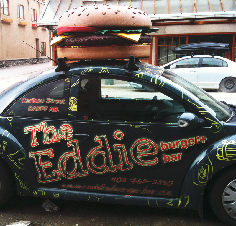
(One of Topmade’s team was out in Banff, and shot a picture of this terrific vehicle graphic display. Wish we could say we designed and produced it, but thought we’d include it here anyway for inspiration. Way to go, Eddie Burger!)
When you run a business, it’s difficult to turn your “entrepreneur brain” off when you’re not at the office. You’re constantly searching for ideas to improve your services and grow your customer reach. That’s why daily inconveniences, like being stuck in traffic, can be so frustrating. It feels like you’re wasting time that could be spent productively. The good news is there’s a way to take advantage of your commute time to achieve business goals – with vinyl vehicle wraps.
Vehicle wraps are vinyl signs and graphics that are applied to your vehicle to advertise your company. This includes cars, trucks, vans, trailers and even buses. While vehicle wraps are commonly associated with service companies, like plumbing, they can be advantageous for any kind of large or small business.
There are two types of vehicle wraps: partial and full. A partial vehicle wrap might include a simple decal, like your business logo, on two sides of your van. This is ideal if your personal vehicle is also used as a company car and you want a more low-key look. In comparison, a full wrap can create complex and eye-catching designs that incorporate your brand colours or imagery. Perforated vinyl, on side and back windows, allows drivers to see out, while the design remains visually intact to outside viewers. Along with typical matte vinyl, you can also integrate metallic and other special effect vinyl into your layout.
Remember, because it’s mobile marketing and your sign will be at a distance from the viewer, you’ll want to restrict the amount of text and use a large enough font size. Your logo and slogan should indicate what your business is about, and there should be a method to contact you, like a phone number or website address. However, there are exceptions – if your business is a food truck or mobile retail, you may want to display more information.
8 Benefits of Vehicle Wraps
They’re on the move. A permanent sign is important for identifying your business and catching the interest of passersby. But wouldn’t it be nice if you could put signs up wherever you wanted, to reach a wider audience? Luckily, you don’t need to! Vehicle wraps go where you go. That means when you’re out and about in your local service area, or zipping through the city, your contact info is visible to potential customers.
They’re keeping it professional. Even if you’re a small company, with a van or two, custom vinyl graphics can provide a generous boost to your public image. Much like a sharp uniform, vehicle wraps on your fleet show the world that you’re an established business with a cohesive team.
They’re personal identification. In modern marketing, a key tenet is “be human.” If your business is located in an industrial park, you can feel isolated from your audience. In this case, vehicle wraps are a simple way for people to see your company actively working within the community. What’s more, if someone spots your professionally branded service vehicle at a neighbour’s house, they’re likely to ask about you and request your services. It’s easier to trust a friend’s opinion than to take a gamble with online reviews.
They’re running 24/7. When you’re traveling around town or parked for long periods of time, your vinyl vehicle wraps are still serving their advertising purpose. Unlike other forms of advertising, there’s no daily budget to max out or a limiting schedule.
They’re 360°. With a full vehicle wrap design, you can advertise your business information on all sides and all across town.
They’re not pushy. Online display ads, for example, can pop up when a potential customer is watching a video or browsing a website. This kind of interruption is likely to cause irritation, not interest. Vehicle wraps, on the other hand, do not interrupt your audience as they go about their day. In fact, a well-designed vehicle wrap can be a welcome distraction when gridlocked.
They’re protective. A common question about vehicle wraps is, “will it damage the paint job?” The truth is, vinyl helps your vehicle resist scratches and dents. And when you want to change your design, or sell your vehicle, it can easily be removed by a professional.
They’re creating exposure. Most importantly, by having a visible presence around town you’ll increase brand awareness. Brand awareness is more than how many likes you can get on Facebook. It means that when someone is deciding who to call about a landscaping disaster, or where to go shopping this weekend, your company will be top-of-mind.
Traditional methods of marketing, such as TV commercials and newspaper ads, are not as effective as they once were. It can also be difficult to allocate the time and resources needed to monitor and engage with social media. So why not use a daily activity, like driving, to your benefit? If you have any questions on vehicle wraps, give us here at Topmade a call. We offer expert signage consulting through every step of the process.
Illegible fonts and glaring colors aren’t the only pitfalls to avoid when ordering and installing your sign. But, don’t worry. A full-service sign manufacturer will have the expert know-how to guide you through the process.
In case you’re curious though, here are some crucial steps for a successful sign installation.
Check local signage requirements. Your local bylaws will let you know what types and sizes of signs are permitted in your area for advertising your business. Before making a hasty purchase, an expert should be consulted to make sure your sign choice meets the necessary conditions. And, if your selection isn’t doable, they’ll be able to find you an appropriate alternative.
Consider local weather. Canadians are well-known for talking about the weather. And for good reason! The local climate impacts what sign type will give you the greatest value before requiring maintenance or cleaning. For example, if your location has a lot of sun exposure and experiences strong winds then a 3D Channel Letter sign might be a better option than a vinyl awning.
Put thought into the location. Sometimes it’s hard to see the forest through the trees. You become so focused on designing the sign, you don’t consider how it fits in the space. Be sure to measure the area, and plan your design, so your sign doesn’t end up too big or too small. If you’re not using an illuminated sign, and you want it to be visible at night, do you have lighting options available?
Speaking of visibility, a sign located over the door may seem like an obvious choice. However, have you checked if your audience can see it from the road or sidewalk? Maybe it’s not a great angle. Or perhaps there’s significant vegetation between your building and the road. In that case, a monument or pylon sign at the parking lot entrance might be a better bet. Take some time to investigate your space and review your options.
Think long-term. We’ve listed design-related reasons why you shouldn’t cram too much information on a sign, but there’s also a cost-related argument. Minimal information means it’s less likely to need updates in the future. And, if you need to include information that changes often, invest in a sign that allows for it. In this case, a digital sign or panel boards.
Double-check the design. If you do a quick google search on “funny signs,” you’ll see that signs with hilarious misspellings or grammatical errors are very popular. But this is probably not the kind of publicity you want for your business. While your file is checked for errors when you send it in to the sign manufacturer, the more eyes the better. Don’t hesitate to ask a co-worker to proof-read the design throughout the process.
Clean the area before installation. When an old sign is taken down, chances are it will leave marks. This includes outlines left by any removed 3D channel letters or holes from uninstalled hardware. Your new business shouldn’t be haunted by the ghost of its predecessor. Not only does it look unprofessional, any visual reminders of another business is stealing your brand’s thunder! When replacing signs, the old sign and its components should be fully removed. Next, the entire area should be thoroughly scrubbed, prepped and painted.
Trust the installation to the professionals. A DIY attitude is a great quality in a business owner. However, it’s also crucial to know when to get professional help. Installing a sign is a great example because it can be dangerous when you haven’t been trained in the proper safety or technical procedures. There’s the potential for the installer or onlookers to be injured, if the area isn’t properly roped off. There’s also the chance of the sign becoming damaged if it’s not secured properly. Suddenly the cost savings aspect of installing it yourself loses its value!
Don’t leave a mess behind. Of course – a professional installation should include a comprehensive clean-up afterwards!
As a dedicated business owner, it can be difficult to entrust an important task, like creating and installing your sign, to someone else. At Topmade, we offer expert signage consulting to help you through each step of the design process. Have questions? Give us a call.
Your customers are as unique as your business, and it’s important to ensure that they have a great experience when they visit. This includes providing information in a way that’s accessible to your diverse clientele – who vary in age, size and ability. Unfortunately, a lot of our built environment is not welcoming to many. For example, when a sidewalk lacks a curb ramp, then people who are using a wheelchair, stroller, bicycle or crutches are negatively impacted.
Universal design, which evolved from accessible design, is based on the principle that design should be functional and engaging for everyone. As signage is a key component in how we navigate spaces effectively, and communicate important messages, it plays a major role in successful universal design. If you’re retrofitting your business to be more inclusive, or starting fresh, here are some things to keep in mind to improve your signage.
“Universal Design: products and environments created to be usable by all people, to the greatest extent possible, without the need for adaptation or specialized design.” Ron Mace, Centre for Universal Design (2007).
Use a sans-serif font, like Helvetica, and avoid “ALL UPPERCASE” text.
Maintain a high color contrast between font and background for optimum clarity.
Minimize visual noise. Too many images spaced closely together can be distracting or influence your sign’s legibility.
If you order additional signs, do not change the meaning of any colors or symbols used unless you update your older signs to match.
Use multiple modes of communication.
The addition of universal symbols, graphic elements, and clear language on your signs, accommodates a range of literacy and language skills.
As mentioned in The City of Calgary’s Universal Design Handbook, people rely on and prefer different cues for information recall. If you’re designing a directory board, map or parking lot signs, designate colors or symbols along with numbers. Keep this formatting consistent throughout the rest of your signs to avoid confusion.
Color Universal Design (CUD) suggests that if your signs use colors as a meaningful design element, make sure to provide this information in another way as well. This guarantees it’s perceivable to people with colour-vision impairments. As an example, for a park map, different trails can be marked by types of dotted lines/shapes along with colors.
Provide tactile information on signs, such as raised letters and braille. Museums, like the National Museum of American History, also utilize audio with their interpretive signs. This is done via the displays or it’s delivered through a downloadable app. For people with a visual impairment, apps offer the additional benefit of voice recognition, screen readers, integrated GPS systems, and screen magnification software.
To learn more about how the National Museum of American History is using a universal design approach with their signs, check out this article.
There should be a clear line of sight to your sign, whether the user is standing or sitting. Additionally, signs created for pedestrian use, like maps, should be tilted so they are functional for people of all statures, whether standing or seated.
Prevent visual cluttering in the environment by keeping the number of signs in an area at a minimum. Try to group information logically into a couple of signs, if necessary.
Keep your signs updated.
Users rely on your signs to be correct. A printout taped over your sign, for instance, is only providing the new information to a portion of your customers.
Universal design is a complex and exciting topic. And we’ve only scratched the surface! Need more professional insight? Give us here at Topmade a call, we offer expert signage consulting to help you decide what kind of sign is right for you.
We touched briefly on engraving in our blog on the natural charm of wooden signs. But we felt that, as an artistic process with such a long history, engraving deserved its own dedicated post.
Engraving refers to a number of techniques where a design is created by cutting into a hard surface such as metal, stone or wood. In the past, it would take a long time to complete a project because the work had to be done by hand. Today, skilled craftspeople are assisted by machines. This allows for complex designs to be faithfully and efficiently reproduced. For example, a CNC machine or laser produces finely detailed work. Another method, sandblasting, shapes a surface by, well, blasting an abrasive substance against it. It’s highly suited for achieving letter depth and can generate a carved/textured look.
As a design choice, engraving adds subtle dimension to a sign. Its understated sophistication is perfect if you want a professional appearance but are on a limited budget. In addition, it serves equally well as the main visual style of a sign, or as a decorative motif. To help the design pop further, the letter impressions can be painted or a foil can be applied.
While a popular choice for business signs and information boards, engraved signs have a lot of non-commercial uses as well, including:
Memorial plaques
Awards
Custom house number signs
Garden accents
What are the benefits of an engraved sign?
A meaning “carved in stone.” Wood, metal and stone are elements of nature that signify longevity. Engraving a personal message into these materials for an award, for example, symbolically pays homage to the lasting impact of the recipient. For a business, the solid appearance of carved natural materials creates an impression of strength.
Your pick of materials. Engraving is a technique that can be used with a wide variety of materials. This flexibility is advantageous, as each design choice for your sign should reflect your brand. For instance, a brass sign presents a traditional image whereas a stainless steel sign is more modern.
Ideal for small projects. Really proud of your home? Share that pride with a custom home address marker. Need to boost employee morale? Honor your team with a personalized trophy for achievement. Engraved signs and plaques are an easy, lasting and meaningful way to celebrate places, moments, and people in your life.
Need professional insight about incorporating engraving into your signs? Give us here at Topmade a call. We offer expert signage consulting to help you decide what kind of sign is right for you.